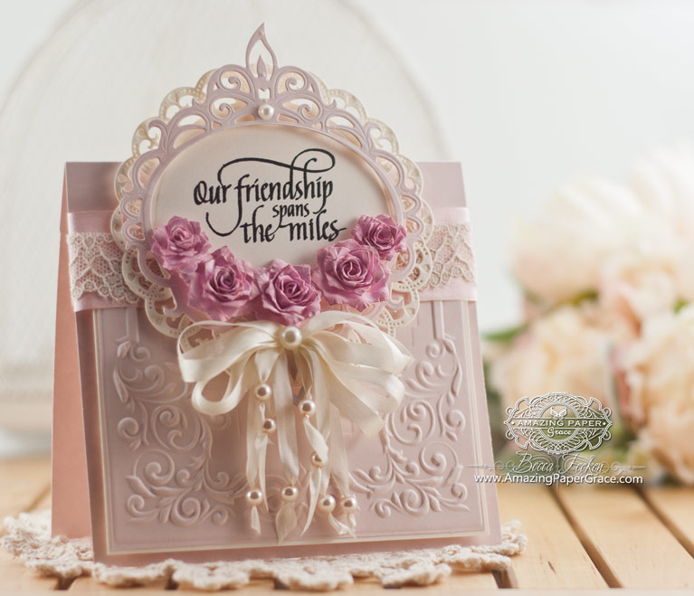
My thanks to you all! I’m blown away by how many of you filled out my survey. I’ll take time to crunch through those in the coming days, in the mean time today I have a new card to share and it is Day of Giving Friday. That means that I’ll be sending the card on to someone who responds today. But before that, let me acknowledge there is a winner. Please check my Giveaway Page then reach out with your mailing address through the contact tab in the upper right corner of the blog. Also welcome to new subscribers joining my blog readership – several of you sent sweet notes – thank you!!
Whats Coming Up?
For the next couple of days, I’m going to be sharing a couple of feminine cards. Beginning Tuesday, January 26th I’ll be showing you glimpses of my new collection shared at CHA. The collection will be available in stores and online for purchase in March and keep your eyes peeled with retailers for preorder :-) I love the whole collection and had three demos at CHA. On day three, I had to revert back to my demo of the first day – by popular demand – I’ll share that make and take as well. As I’m given more definitive information, I’ll share it here.
Day of Giving Friday
Ah, I have missed you!! If you are new to my blog, Day of Giving Friday comes out a desire to keep the handwritten word alive by our kind tradition of showering with handmade cards. The card shown will go to one of my sweet readers who leaves a comment today for more information, you can read about it on my FAQ List at #11 – just click the link.
An Unexpected Flower
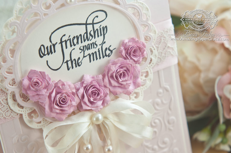
Today I’m sharing a card with an unexpected flower. This fall I received a die that was simply intriguing – Spellbinders Pinecones. (Seriously, click the link and have a gander and what the made version looks like as opposed to my flower!) Oh how I wanted to play with it. This fall was so busy that it passed me by and even though I didn’t make pinecones, I dreamed of how this sweet little die might look as a flower. We’ll what do you know! It makes a sweet, petite flower that simply gets curled around like all spiral flowers. So easy! And now I have a double duty die!! Otherwise this is a simple card that measures 5-1/2″ x 7″ with an actual card base of 5-1/4″ tall by 5-1/2″ wide. I layered Spellbinders Royal Circle on top of the main panel then added Spellbinders Majestic Oval as a frame for this fabulous ‘friend’ sentiment by Quietfire Design – In A Perfect World. The lower part of the card is covered by a panel embossed with Spellbinders Shady Allure.
For your comment today, tell us, what’s your ‘go to’ color for most of your handmade cards.

Rubber Stamps: Quietfire Design – In A Perfect World
Craft Paper: Neenah Classic Crest Natural White – 80lb smooth
Ink: Versafine Onyx Black
Accessories: Spellbinders Pinecones, Spellbinders Royal Circle, Spellbinders Majestic Oval, Spellbinders Shady Allure, Darice Pearls, May Arts Silk Ribbon
.png) I can’t say thank you enough for the information you gave me during my recent survey! Thanks so much for visiting – I’m so happy you dropped by! Sending a prayer to all those in the area of extreme weather – please take care!
I can’t say thank you enough for the information you gave me during my recent survey! Thanks so much for visiting – I’m so happy you dropped by! Sending a prayer to all those in the area of extreme weather – please take care!











I don’t know if I have a main color that I use…kinda depends on who I’m giving it to I think, as I try to use their favorite colors if I can. Love your beautiful card…and how wonderful the die can do double duty! Love those kinds of dies. :-))
First off I am wowed by today’s card! It is simply elegant beyond words. Just gorgeous. The first color I think about are the paler colors but I absolutely love black and whites. The pink on today’s card would be right at the top.
I never would have guessed that was a pinecone die!! Superb! I usually pick up whatever colors go with the main colors in my stamped image, but they are most often shades of pink.
Becca this card is absolutely stunning! I love the soft colors and that pinecone/flower die does indeed make a beautiful petite flower! I love how cute they are and love the color too!
I am so very happy that you were given a ton of feedback on your survey. I hope that it helps you to explore many more avenues in your crafting and helps you to focus in on something that can potentially open up more doors for you. Feedback is always a great tool to help guide us along our path.
And thank you for the well wishes! I am one of those people directly in the path of the major storm coming into the east coast. I live along the shore coast in NJ and I literally live right off the water. I have the bay in my backyard and the ocean four blocks up. We are expected to get between 6 and 10 inches of snow and then it is supposed to change over to rain. And add to that, very dangerous and high winds along with three high tides during the duration of the storm. We are already being told that this is the worst storm since Hurricane Sandy and we will be experiencing major to extreme flooding. I just pray that our power stays on and that the flooding does not become too severe that we would need to evacuate. So I do appreciate the well wishes and any prayers that you can send toward NJ’s coast.
I hope you have a very relaxed and beautiful weekend.
Hugs,
Jo
Wow! I love the flower pinecones. I love your feminine cards. This is excellent. My most used color I think must be cream base and probably with greens and blues and pinks.
oh becca this card is gorgeous. I love a dual purpose die and am looking forward to all of the cha releases. I hope you have had a couple of days to recoup from your trip there.
What a lovely card!! I really don’t have a go-to color. On gloomy days it’s usually brighter colors, but the occasion usually dictates colors — also recipient. We do cards for a nursing home, so we go with bright colors for them.
What a beautiful card and I still use so many of my old Spellbinders dies, they are so versatile. The Quietfire sentiment is perfect for such a ‘peaceful’ card such as this.
I’ve been lucky enough to purchase the Cascading Grace dies just recently, how gorgeous they are.
LOVELY BECCA! TOTALLY LOVELY!!! CAN’T WAIT to see what you have for us! My “go to color” lately, has been RED, for Valentines! ;)
What a gorgeous card! And a clever idea with the pinecone die. I seem to be using a lot of kraft cardstock for my bases but then match the remaining colors with the images – with pink being my favorite.
Well green is my favorite color but I always seem to start with a white base. Thanks for your talent which you share so easily.
I don’t have just one go to color, but usually whites and pastels or soft colors. I love the bow on this card!
I really don’t have a go to color, it just depends on what I need a card for and for whom.
Although I have every color under the sun I usually go for the pink and lavender colors.
My favorite go to colors are teal and pink! Love this card and the use of the pinecone die!
Hi Becca
Gosh ! what a beauty of a card such a delicate shade of pink ,i love it .
My colors have been a lot of pink and brown ,however i do use a lot of white on white too.
God Bless.
Elaine H X
My “go to” color is blue, although white on white is a close second.
My go to color is white with atone on tone texture. Congrats on your new collection!
Awesome card again today! I usually use white as the base card but pastels for the front panels. Lavender is a frequent cover.
So beautiful! I am never disappointed by one of your cards. Thank you for sharing your passion and talent with all of us.
Becca I LOVE your style. It is Timeless Elegance!!! Thank you for sharing your talent with us.
Good Morning Becca, I love this card, the colors are so soft and it’s amazing what you were able to do with the pinecone dies. I’ve been into tone on tone color cards lately, but I guess I really don’t have a favorite since it changes with the seasons. TFS.
This is absolutely stunning Becca, I love the embossing folder, as well as your beautiful pink roses. Hugs!!!
What a beautiful card!! I really appreciate you showing us tips on how to make more out of our dies. Thanks!
What a beautiful card, wow.
I usually like the contrast of burgundy with the cream.
I don’t have a go to color. Super smooth white cardstock is my go to card base. Pink and blue of any tone, shade, chroma or pure pigment is my favorite color combo. I love to explore color and texture so you won’t see this color combo ‘tooo’ frequently in my paper craft!
What a perfect card for my Granson’s wedding. You have exceeded my expectations, as this card is far above the ordinary and believe it or not I have the dies to make it! Yea! Thank you, Becca, for your talent and inspiration.
Hi Becca. beautiful card, and fabulous flowers, will have to have a look at this die. Looking forward to seeing your new dies, if they are as beautiful as your last ones we are really in for a treat.
Take care
Wendyx
Oh Becca, what a gorgeous card. Thank you so much for sharing your talent!
I love all colors and use all colors. However, if I’m in a creative slump, a cream and blue combo always gets my mojo going.
Have a beautiful day!!!
If I had to pick “just one” Becca card so far, today’s exquisite awe-inspiring creation of your’s has to be it! WOW!!!!!!!! What a way to start the year! I can’t take my eyes off of it. You have such a wonderful sense of design. I never would have looked at the pinecone die and come up with a beautiful flower. Spellbinders should be extrememly pleased with you for showing us readers a new use for this die. Now to today’s question – my favorite ‘go to’ color for most of my handmade cards is any tint or shade of purple. I do however try to use a color on a card, for giving, keeping in mind the receiver’s color preference. I do “love” color and enjoy seeing and “playing” with different colors. God made so many wonderful colors for us to enjoy in nature.
Hi Becca, beautiful card, and I really love the flowers, will have to have a look at this die.
Really looking forward to seeing your new dies and it they are anything like your last ones we are really in for a treat.
Take Care
Wendy
What an awesome use of the pinecone die! Just beautiful! I don’t really have a go-to color. I love using all colors! It all depends on the theme of my card.
Oh what a beauty. I have just the person for a beautiful card like that! I can’t wait to see all of your new products from CHA.
Wow Becca! What a stunning card!! So lovely!!
My go to color is usually light pink! :)
On my! I’m blown away by the beauty of this card today. Not that any of your cards are bad but this one grabs me. :) My go to color is blue in any hues. Thanks for the chance to win this fabulous card!
Hi Becca,
I love all your cards. This one is really special.
I am keeping a list of the dies you use & hope to get them at
one of the conventions in this area.
The color I go to is different shapes of blue.
If it is for a certain person then I try to come up with a color
they like.
Looking forward to see your collections of dies.
Hi Becca. What a card! Love the flowers and the bow with pearls on. Fabulous! My go to colour is pink for females and blue for males both on white card bases. I must try to use cream more for my bases note to self…… Happy weekend
This is such a beautiful card Becca. I would be delighted to receive it.
Love this card! My go to color is anything in the range of blue. It is also a color that I wear a lot and use around my house.
My go to is black or brown or an oatmeal colors…sorry I didn’t see your survey to do. : ( Lovely card!
My go to colour is cream or ivory., whichever I have on hand. That way I can colour of a different colour if need be. X
Good morning Becca
Beautiful card as usual, my favourite colour for my card background is espresso brown.
Beautiful! I had to hurry through the post to find how you made those flowers and voila, you told us how to use another die for multipurpose!
My go to color is usually pale cream. I love white but sometimes find it too stark. Cream is so soft and lends itself to most any color I would accent with!
Have a happy day!
I think this card is exceptionally pretty and love how the ribbons hang down with the pearls on them.
My go to colors are usually in the pinks and lavenders for girls and browns and blues for guys.
This is stunning!
I usually use blue.
Hi Becca, thanks for the chance to win but I am SO happy for the winner!!! (We can’t ALL win! LOL)
Your card here today is as beautiful as all of your cards! I would love to be a winner of one of those! I have recently been drawn to win another persons card (Marika Rahtu) and I can NOT wait to receive it! I have a place of honour (5 display boxes, one will soon be filled!) in my craft room already waiting to show it off to anyone who enters…
Thanks for the chance to win one of yours!
I’m so glad I decided to follow your blog each card is an inspiration as are your kind and generous words to us all. S o happy to be hear and what a fabulous idea is the day of giving.
Marie
Great card Becca! White with pink or white with aqua are my go to colors. I usually add in a coordinating color with them.
I love, love, love this card! Lace, pearls, ribbon, flowers and PINK . . . All of my favorites! ! Your use of the dies and embossing folder are fab! Beyond using the neutrals (white, cream, black or browns), I choose the color on what the recipient likes.
Becca, I am blown away by your use of the pinecone die to make such sweet flowers. I made several pinecones using the die, but was never really satisfied with them. Now I will definitely try making the flowers!! My “go to color” is pink, although I love using soft, mossy greens.
I like to make all color card bases. But I think my go to color would be white and use colored card stock and patterned paper for color.
Hi Becca, I’m a Victorian at heart and my go to color combo for cards is any variation of pink….mauve, dusty rose,burgundy…. paired with a Victorian green – light or dark. I really have to force myself to use other colors, but when I do they’re usually in the muted dusty tones as well. I love all your cards and am looking forward to seeing (and I’m sure buying) your new dies.
I soooooo love what you did with the pinecone!
Your cards are such glorious works of art!! Love the colors on this!
Card color usually depends on occasion, season and recipient. Right now I’m using red and white for Valentines. I would never have guessed that the beautiful flowers on your gorgeous card were made with pinecone dies!!
I like to use neutrals a lot in my cards, so I guess anything in the tan line would be my go to color. Your card is amazing Becca.
I love all colors but I would have to say that I like pink, mauve or dark rose the most.
Thanks
Your Sister in Christ
My go to color is “berry.” Your cards get more and more gorgeous. I recognized Shady Allure because I just got it.
Hi Becca
What a wonderful card you have maked for this give away.
And who would guess that the flowers are made with a pinecone die.
Have a nice weekend.
Hugs Kira
My go to/is usually off-white. Love the way this card looks. Who knew you can make those flowers with the Pinecone die. Thanks for the tip!
Gorgeous card!! Love the flowers!!
I love pastel colors, I try to make the cards to the favorite color of the person I am going to sent it to. I use a lot of Aqua blues. Christine
My go to color is probably white. I have loved what you do with it & try to copy. Usually though I use a pastel pink, yellow, blue, or green with it.
Can’t wait to see your new dies. I just (finally) got the ones I bought from Create & Craft & am very excited to use them. One of them is your flower dies & I am reviewing your videos showing how to use them.
Dixie
Hi Becca!!!! As a scrapbooker I don’t have a go to color for cards. I make them as the need arises (sympathy, birthday etc) and then pick and choose the colors based on the recipient. The last card I made had a bouquet of flowers on the front that I colored with my orange and red distress markers on a cream base.
Good morning, Becca! Gorgeous card design; love! that you used the pinecone die to make roses. I can’t wait to try some of my dies as flowers. Yikes. ?
My go-to colors…….this is difficult for me. Not sure that I have any. I do love neutrals, though. Always have some white, black, brown & beige in my closet. Does that qualify? Lol I have heard that our clothes & our art tend to mimic each other. Hmmmmmmm, something to think about. ?
Gorgeous card; so creative turning the pinecone die into a flower! My favorite go-to-color is becoming white on white lately; if not that, then I usually use red or blue or pink.
Another stunning card.I love the layering and soft colours. Pink and white are go to colours.
Hi Becca,
I think my go to color is blue. For me, it’s an easy color to match with many others, depending on the shade I choose.
Again, you take the usual and create something entirely different. That magical, talented brain of yours :) I love the embossing folder. So delicate. I hope that with CHA behind you (at least until the summer show ramps up) you can enjoy the more relaxed time in your studio. I just love seeing a new post from you in my in-box. Sending hugs, Diana
WOW!! How stunning and beautiful!!!! What a nice surprise to find out that your die can be used as not only a pinecone but a flower too!!!
I really don’t have a go to color. It depends on who I am making the card for.
I love girly girl cards. This one is stunning. My go to colors for cards usually lean towards the pinks and lavender. I love cool colors as opposed to warm colors.
My favorite color I go to is the rainbow – meaning I don’t have a favorite color. It’s whatever goes with the rest of the papers I choose. I love and appreciate your creativity with dies. You look at a die and see many many pictures! Thanks for the chance to win.
Hi Becca, Give you anything–piece of paper, die, ink and you turn it into magic. Thanks for re purposing the pinecone die. I have the die but never thought to try it out after Christmas cards were done and just added it to my collection of those things I couldn’t live without but managed to do so. Keep the magic coming. Barbara
That’s what makes your take on cardmaking so different. You take a die that is supposed to make a pinecone and turn it into a delicate flower. That is so awsome. Purple – my go to color.
I can’t believe this is a pine cone die. OMG those little flowers are beautiful. The card is beautiful.
My go to color is normally a blue/green. Sometimes I can’t get away from it.
I have a hard time with orange and purples.
Gorgeous, Becca! Love your work! Go to color? Depends on the occasion, but I love cream, ivory, ecru
How clever that you would look outside the “pinecone” box to create this beautiful flower. It’s always “amazing” to me that you see something that no one else might see. Thanks for all of your generosity.
What a fabulous card! I love everything about it and those flowers are stunning!
I love so many colour combinations that it’s difficult to choose just one. White and lilac is a very popular duo with the group I host. We did white and pink with a dash of green today and last Friday, white and aqua. We’ll be moving to creams, yellows and golds in the next couple of weeks! I often use white and silver, maybe adding in a splash of another colour, depending on the recipient.
Thank you for showing us your beautiful cards!
Hugs
Anne (UK) x
Gorgeous card! I love making white on white cards, black & silver, and pinks. Your cards are such inspiration to me Becca!
My main color seems to be a teal if I am working with white or a milk chocolate if a ribbon so I guess I have two colors that do work well together, especially with white & pearls.
Wonderful card, Becca! What a great idea with the pine cone die! My “go to” colors are mostly shades of green and pink, but if I know what are the recepient’s favourite colors, I use them :))
What an elegant card & clever use of the pinecone die! I often use blue.
Once again, Becca, you’ve outdone yourself! What a beautiful card! I usually pick colors for the person I’m making the card, but if it were up to me, all of my cards would have some hint, or more, of purple!
Such a beautiful and elegant card. I really love it and all your card creations. Thanks so much for sharing the supply information as I’m starting a list of the dies I “NEED” as I drool over your cards. One of my favorite colors for cards is primrose (for girly cards). Thanks again for all you share!
My go to color is definitely mauve…….Love this color! Your card is Gorgeous today, Becca……so lovely and feminine! Thx for sharing your talent with all of us! I do appreciate YOU!
Oh Becca what a stunning card & how I’ve/we’ve missed seeing them. My card bases are usually white and the main color usually depends on the occasion &/or recipient. I tend to favor green, pink and purple.
Really? A pinecone transformed into a flower? Your creativity is awe inspiring as always. My card colors vary depending upon occasion and recipient however I usually use a white or cream cardstock for the base.
What a lovely card! So stately…so you! Welcome back from CHA! I missed the post last week so I’m a little late with that greeting, but no less heartfelt.
My go to colors tend to be greens and blues…all shades of them. When I display my cards for sale, I end up with a good visual of what I have been tending toward, so it keeps me from Using too much of the same color palette, which is helpful. When I make individual cards for family and friends, I use what I know they love.
Again, good to see you back! Blessings, Becca.
Joni
Beautiful! My go to color/ always ‘correct’ color is white. how exciting, eh? when I’m completely stumped for ideas I revert back to white and accent it w/colors that might match the theme or recipient’s fav’ color. work great for me. Aloha.
Hello Becca
My go to colour is Aqua then Pink!
Todays card is beautiful and whoever you choose will be delighted!
Take care Dear Becca
Love Marg
Good Morning Becca,
My favorite colors are pink and yellow. So, your card is magnificent, in my color world. The entire card is gorgeous! I, especially, like the flowers. I wonder if my flowers would turn-out, like yours???? Smiles~ The sentiment touches my heart. I’ve followed your lead and have purchased a few stamps from Quietfire. They are so beautiful and unique! Thank you, for being my inspiration! Cynthia
Hi Becca,
I actually try to make my cards the ‘favourite’ colours of the person I am giving it to.
When I play and do my own thing I am always drawn to pink and green and turquoise!
What an exquisite card you have made today. Love the roses!!
Thank you :o)
Awesome card Becca. Thank you for inspiring and motivating all of us. The color on my created card is based on the recipients favorite, otherwise, I reach for the Pinks for the ladies and denim blue for the guys.
Oh, my ! I love these little flowers so much!
—
For my main colors for go to colors I have to admit they are usually blues and greens. Everyone needs a bit of color in there life. ;o)
Lovely creations my go to is pink purple and blue together!!!A lovely trio combination!
Absolutely gorgeous and of course, if anyone can think outside the box, it is you!
Oh, wow – such a pretty card! I like the pearls on the ribbon, the sentiment and your flowers, which turned out so well. Thanks for telling us about the dual use that you discovered for the pine cone die. I don’t have a go to color. It would depend on what else would be on the card and to some degree, who the card is for. If it was for myself, it would be purple.
This is another absolutely beautiful card, Becca.Love those flowers! I like to use white or cream as my base card and then add colour with the flowers and embellishments.
I can’t believe the beautiful flowers were made from the pinecone die. Way cool! My go to color is white. It goes with everthing, lol!
This card is lovely, Becca. I can see why you made roses from the pinecone die. They are very pretty!!
My go-to color seems to be green. I don’t even like green that much, but it seems to be the color I most often reach for in making my cards.
WOW, love your card, it is stunning, so are those roses, I think the petal shape is so much nicer than the rounded type, (my opinion only). The embossing and dies are beautiful too. You are so inspiring.
Beautiful, beautiful card!
I do a lot of white on white. It looks elegant to me. Then sometimes just a pop of one color.
have a blessed day.
Beautifully elegant. My color is white. From looking at your work over the years, you have shown me how versatile the color white in creating different level of moods and emotions.
Oh my gosh! That card is absolutely gorgeous!!!! My to go color(s) is pink and green together…..I love how they loo! Thank you Becca!!! Trish
This friendship card is simply beautiful and the tiny flowers are the right touch with the pearls on the ribbon. You are so very creative and inspiring. Thank you for sharing this card.
Hi, Becca,
Today’s card is absolutely gorgeous! Flowers are such a perfect design element. I encouraged you to design more flowers in my comment last week and I felt like “that girl doesn’t waste any time” when I saw this week’s post. Awesome!
I must admit that I use cream or white card/envelope blanks for the majority of my cards. My design paper layer usually determines the other layers. I did give some thought to the color of solid card stock I buy and I use a lot of black, browns and rich greens. Since I started making cards, I pay a lot more attention to colors and the subtle variations. In trying to match a “cream” color – I discovered a Christmas paper I purchased had the faintest shade of pink – just fascinating.
Can’t wait to see your creations!
Love and blessings,
Sandy
I am drawn to blues and oranges but have no primary pick for card making. It just depends on the occassion and who it’s for. Beauty of a card today!
Becca, this card is so gorgeous! I love what you did with the pearls & ribbon.
You are a clever lady. I would never have thought to do this with pine cone dies, very versatile. That is why we love you & Spellbinder dies :)
I do not really have a go to colour. It just depends on who I am makong it for & what the occassion is.
Have a great weekend! x
My go to color for most of my handmade cards usually starts with a cream color base, pastel adornments, and gold metallic highlights/trim.
As usual, your card is beautiful, and thanks for sharing how to make the die do double duty! I tend to go to a white card base and use a lot of black with a pop of color, I like to add red to that combination.
I tend to lean towards soft shades, especially pink. Loving the flowers made from the pinecone die!
What an absolutely stunning card, Becca. As usual, you have shown us such a Beauty! I don’t really have a “go to” colour – it depends on who I’m making the card for. I tend to go for blues and navies or browns and creams for male cards but for female cards, I try to go for the recipient’s favourite colours, with bright colours saved for children.
Doreen R from Bournemouth UK
I always go to the creams, whites, pinks and golds. Your card is just gorgeous. I’m in the hospital right now with second and third degree burns but I can’t wait to get home to try this beauty. I love your work. And as always thank you for sharing your talent with us.
vICTORIA,
Will keep you in prayer that you heal very fast.
Hugs
Ann Robbins
Oh my, my, my! Talk about a georgous card, this is it! Beautiful Becca! Another masterpiece. Boy would I ever love to have this one!!!!!
My go to color is white on white (when appropriate). Otherwise, if I am making a card, I try to use the person’s favorite color in an attempt to make them happy. I personally love yellow, it reminds me of the sun and living here in Florida, love the sun.
Waiting patiently to see all the new “stuff!”
Hugs
Mstgane
Ann Robbins
Your card is lovely! My go-to-color are all of the different shades of purple. My birthday is the 26th of January.having lunch with several friends, most of whom are stampers. We get together to make cards for many different projects, so much fun to share that I won a “Becca” card.
My go to color is pink of one shade or another. I love your card today and the roses are beautiful!
The card is lovely, I enjoy reading your posts, and trying to make your cards, my family and friends your cards.
Thank you for sharing.
Love the card, mine is the basic color of white, black or cream for the base. I love soft colors too but the basics help because I can buy in bulk cheaper and make more cards
Love it, love it, love it! So pretty, Who would have thunk! That die is very cunning hiding out as a pinecone! I have looked at it before and thought how often would I use it? Silly me. As always your bows and ribbons are jus the right touch! Blessings, Lisa
Oh my goodness, this is beautiful. I can also see this style working for a baptism card as well. Just need to change the wording on it. ?
This is a very beautiful card!!!!
i ALSO HAVE THE PINECONES DIE AND FIRST THING I DID WAS A FLOWER. LOL. LOVE TODAYS CARD THE PERALS ON THE RIBBON IS FANTASTIC. I HAVE SEEN SOME WONDERFUL CLIPS OF CHA. THERE IS ONE WHERE YOU ARE STOOD IN THE BACK GROUND WITH A MAN. I WAS SO BUSY WATCHING YOU I DONT KNOW WHAT THEY WERE DOING ON THE DEMO LOL. KEEP UP THE GREAT WORK.
Stunning card! My go to color is the neutrals color family. Then add pops of color.
My go to color lately has been blackberry bliss and Early Espresso from StampinUp. Seem to be stuck on them lately. As for your card, absolutely beautiful. I looked at those flowers and asked myself how you made them. Never would have thought it was a pinecone die. You cease to amaze.
White (not really a color) is my mainstay, then it’s likely shades of pink for many of the cards… sometimes blue for the guys…
Becca – This card is so awesome. Who would have thought a pine cone die would make such sweet flower. I love how you used to pearls on the ribbon.
I really don’t have a go to color, but I love bright colors, but also kraft and white.
Such a beautiful card Becca! Thank you for sharing your remarkable talent!
Beautiful card and the flowers (pinecones) are awesome!My go to color is cream. You can put any color or pattern with it for male or female.
Beautiful card and a lovely sentiment. So glad to see a different use for the pinecone die and so very clever of you. Thanks for sharing the beauty.
Good morning Becca, first things first Congratulations to Patricia Murphy you lucky lady!!! Oh my what a simply stunning card!!! My go to colour depends on the recipient!!!
Have a good one!!!
Loopy Lynda xxx
My “go to” color is yellow.
My “go to” colour is lavender/lilac, but I also like black and white cards as well.
My “go to” color is actually a combination of black, red and white. My Mom used to wear a lot of these colors and it always looked so classy on her. Whenever I’m drawn to a classy card, it usually is the combination of these colors. Whenever I’ve crafted a WOW card, it has been a combination of these colors. I use Neenah Classic Crest Avon Brilliant White for my white. I loved the card you did for today and particularly thought the little flowers set off the Quietfire quote very nicely. Thanks for such wonderful inspiration, Becca.
I’ve thought about your question and I don’t know that I have a specific go to color, but I do trend towards greens, blues, yellows, and purples. Love your survey with the questions that really made me think! :) I also love your card today, Especially the embossing folder! Beautiful!!!
What a pretty card so feminine I have to say I love white or cream classy
and goes with most things .
The embossing folder is yummy and the flowers toooooo and what about
the sentiment love it ! Thank you for sharing Pam XXX
Hi Becca, What a beautiful card, you always come up with lovely card and love your roses from the pinecone dies. Well my go to color for the base of most of my cards is white then add other colors to go with my design.Love.Yvonne N.
What an amazing idea! Those flowers are wonderful. I usually start with a white base and let my brain take me to the rest. I do go back and forth over colors depending on to whom the card will go.
Beautiful card! I really like pink-every shade!
Beautiful card today! My go to color lately has been chartreuse……
What a beautiful card! I love all colors but tend toward the blues.
My go to color would depend on who the recipient is or occasion.. But in general I like the neutral tones or pastels.
I like to go to pink as I have a lot of pink paper.
I just wanted to say that this card is gorgeous. I especially love the lace the you used.
Blessings,
Kathleen
Becca, this is a GORGEOUS card!!!! It seems I have to focus on using other colors as I always reach for aqua – LOL! It is definitely a challenge, but I am enjoying it!
Paper Hugs,
Jan
I just love this card. I was looking at it, thinking it is one if love to make for my friends birthday when I realised it is today’s giveaway. I’m definitely a pink girl but sometimes I can surprise myself by using vibrant colours outside the usual spectrum. Must look for the due with the flame in the centre – that’s a real winner. Thanks again for for three fabulous ideas.
Good morning Becca,
This is another simply beautiful card flower and i do like your pine cone flowers as they look beautiful as such. I love the colours, the bow with all its loops and pearl ends, the dies that you have used to create this work of art and the beautiful sentiment that just says everything you want to say. Thank you Becca for your work of art that is pure joy to look at.
love and crafty hugs
Norah (Glenochil Village, Scotland)
What an awesome card here today again Becca, you just never disappoint and make beauty out of anything.
The colors I most often grabs for is blue/green shades or at least different dusty colors or pastels what ever you call them. I love those soft dusty colors and they always looks nice on anything you make.
Beauty and Inspiration,
Thank You Becca for sharing both with us.
Beautiful card Becca! Love the flowers. I have this die but have not used it yet, going to have to give the flowers a try! Thanks for the inspiration!
Love to use crisp white with English flower garden colors of yellows, blues, & pinks.
Oh my! This card is absolutely stunning, Becca! I adore everything about it from the beautiful flowers from the pinecone die to the dies and embossing folder that combines to create a piece of art. Even the ribbon is elegantly used! I nearly missed this post and I’m so this didn’t. This week has been hectic with medical appointments every single day. Unfortunately, we have more of the same this coming week as test results are coming back in preparation for traveling to Mayo Clinic in Minnesota for my hubby’s specialized open heart surgery. We have a total of 20 medical appointments in January! I’m exhausted, as is my husband, but I come to Amazing Paper Grace and see your lovely creation and my mind moves from the stress of medical issues to the beauty of your art. When I saw this card in my favorite color, my heart smiled! Thank you, Becca for sharing a part of who you are and bringing sunshine to us.
Thank you once again for the inspiration. The color I seem to always reach for is a shade of orange. I am not too sure why as I don’t wear this color but I really like how it looks in a card.
WOW, I am head over heals in love with this card! Just love your flowers, the sentiment and your bow, especially with the pearls add to the streamers! Feminine all the way!
I love the color blue, usually blend it in with purples and add a touch of green , either as leaves or background.
Such a beautiful card. Your creativity is amazing and you are truly blessed with your talent.
I have no one go to colour, but I do use pink and blue tones a lot. Love your gorgeous card Becca.
Blessings
Maxine
Well of course I missed yesterday, but couldn’t be helped. doctors appointment does take priority. Beautiful card I really like how you used the ovals and embossing together. thanks for sharing.
Hugs
Kay
Just ordered Shady Alure. I am not sure how that folder has managed to escape me. I know you have used it in the past and I loved it then, but this time, I made sure I had it added to my arsenal. LOL I also ordered the pine-cone die cause I love the flower you made with it. I like it better as a flower then a pine cone that’s for sure. I personally think that Tim Holtz nailed the pine cone that he came out with and it would be really hard to top that one. But, thanks to you you saved spellbinders by coming up with a totally different use for this die and it really makes an impressive flower. Way to go Becca as always.
Marcie
I get so much love and spirituality by the beauty of your cards.
Becca, another amazing card. I try to make copies of your cards but they never turn out with your beauty. You are the best!