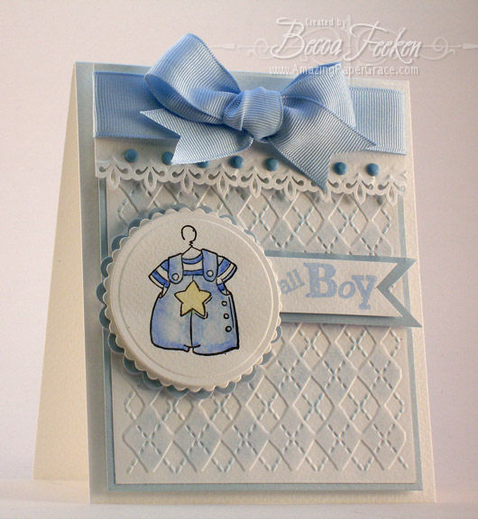
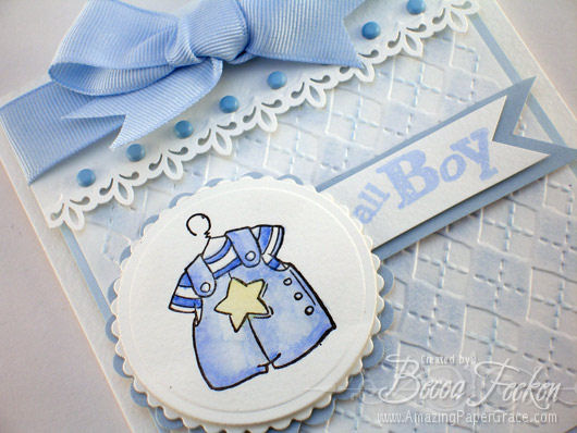
Yes, I am loving, loving, loving the new Cuttlebug embossing folders. This one is called Argyle. I’m trying to keep things simple, but I feel a little bit naked without layers. To emphasize the dimension on this embossing folder, I used soft chalks to add a little bit of color. The background is then popped on a piece of metallic blue paper then attached to the background. I’ve been using Fabriano Acquarello Watercolor paper because it gives such a deep impression when embossed. It has a rough texture and takes chalk very differently than the smooth white Georgia Pacific cardstock I normally use. I’ve also tried to use a little bit of depth with the border punch used at the top – it reminds me of a fancy valance.
I hope to have more this week using Cuttlebug items!
Supplies:
Stamps: Stampendous – Baby Boy Clothes, Scrappy Cat Stamps – Sentiment
Paper: Fabriano Acquarello Watercolor, The Paper Company – Metallic
Ink: Black Brilliance, SU Brocade Blue, SU Barely Banana, SU Bashful Blue
Accessories: Cuttlebug Embossing Plate, Nestabilities, IKandee Chalks, Fiskars Border Punch, Brads, Ribbons













Oh Becca, this is so darling! I love the way you popped up the layers! What an impact that creates! DARLING!
Fabulous card Becca… The watercolor paper does take on such a nicer impression that regular cardstock.
Have a great day!
I love this card! I didn’t order this embossing folder, but I just knew that someone would make me regret not ordering it :). Now I will have to get this too ;). The card is just beautiful, but all of your cards are.
Stunning…TFS!
This card is absolutely stunning !! Every detail is perfect. I sure hope it ends up in someone’s baby book to be looked at for years to come ! :)
Becca….is that Three Layers to the nestibilities with the cute little boy jumper? It looks almost like a button effect, the way the top layer stands out and the scallop looks like it’s underneath. Darling card…..as usual.
How adorable :) That’s a keeper for sure! I can’t wait for the day I get a cuttlebug!
Hugs,
Joani
Absolutely adorable! The argyle background is perfect for this card.
Great job!!!
God bless.
I lopve this one. It is stunning
I love this one. It is stunning
This is so cute!!!!
God bless
Giovana
This is awesome. The coloring and layout are great. Plus You have to coolest new toys. Thanks for sharing.
Wow, I just found your blog and love your designs. Everything is beautiful.
Oh, Becca! This is so gorgeous! I love the chalked texture and that punch. . . Hmmm–might need another punch now! ;-D
Every detail is perfect. I’m so so so glad I found your blog!!!
This is one of the most beautiful cards I have ever seen. I am totally impressed! Wow.
Darling baby boy card, Becca! All the details on here are wonderful!
Becca, I love your designs. This card is stunning! I have never seen theat punch before. I think I need it… What is the name of it? Thanks and I look forward to more of your ideas
I love this! I knew that I wanted that folder as soon as I saw it. Now I have to find it. Your card is wonderful. I appreciate your detailed explanation. Thank you.
This is just precious. The layout, the border, the little romper…all adding up to one fabulous creation. Thanks for sharing on SCS and for the details there and here.
Love the colors and the bow and the argyle is so appropriate.
I have just purchased this folder and was looking for some ideas, I never thought of baby cards but this works so well, I hope you don’t mind me borrowing your idea – not the whole card just the background.
Oh this is lovely! Thanks for the tips of all the details–they really do make a difference as shown in your work!
I am new to your site and am amazed at your talent. After seeing your work with the argyle folder and your tips on the paper, I am anxious to try this method. Many thanks for your generosity to share ideas.
baby books should have as many pictures as possible because babies like to see pictures .:~