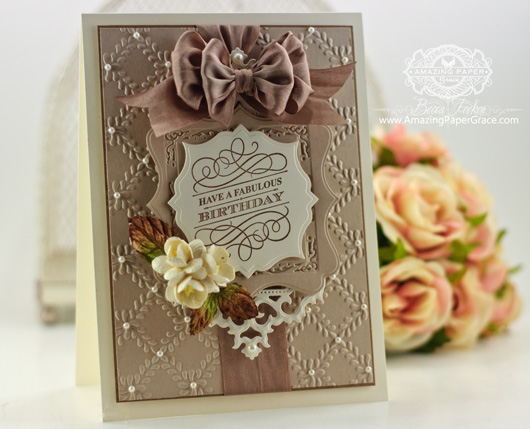 
Sweet blog friends, I have an admission to make. I do my best when I don’t over think about what I’m doing and it just happens. That sums up today – I just finished making a series of samples that had me a little bit stumped because I had already used the dies and layouts extensively and had to come up with some fresh ideas (more about that later this month). So as I sat down for this card, I just let things flow. I was mildly surprised that what came out was the kind of style that I’m most at home with and it feels very authentic to me. Are you like this? What happens when you just let go and sit down to create without any expectations? Today is one of those days. My designs are “die cut” centric – in other words most of the time I design around dies and find room for the other items later. That’s probably the exact opposite of many of you, but it’s just the way my mind works. Today it comes in handy because Justrite Papercrafts is rolling out new images and today we’re showing Grand Birthday Sentiments (it fit so nicely in the space I left for sentiments :-)
I pulled from some of my old favorites on this card by reaching for Spellbinders Antique Frames and Accents, Spellbinders Labels Sixteen and mixed in some new with Spellbinders Gold Squares One and Spellbinders Labels Thirty Two! I’m falling back in love with texture and find myself reaching for embossing folders with much more frequency – here I’m using Spellbinders Garden Lattice.
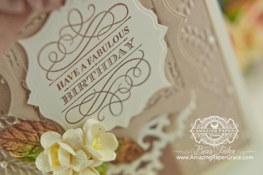 
Here’s your Step-By-Step Recap, from the bottom up, just in case you’d like to make one too. Start out with a cream card base cut to 5-1/2″ x 7-1/2″, foam tape, brown matting layer cut to 5″ x 6-7/8″, panel embossed with Garden Lattice embossing folder and cut to 4-7/8″ x 6-3/4″, foam tape, die cut layer using two Antique Frames glued with top at opposite ends, foam tape, die cut layer with Labels Sixteen embossed with Gold Labels One, foam tape, die cut layer with Labels Thirty Two. Add pearls, bow and flowers on appropriate layers.
| SUPPLIES I USED |
Stamps: Justrite Papercrafts – Grand Birthday Sentiments
Paper: Neenah Classic Crest Natural White, EK Success Putty
Ink: Amuse Studio – French Roast
Accessories: Spellbinders Antique Frames and Accents, Spellbinders Labels Sixteen, Spellbinders Gold Squares One, Spellbinders Labels Thirty Two, Spellbinders Garden Lattice, Recollections Pearls, May Arts Silk Ribbon, Mulberry Flowers, Becca’s Bow Maker, Grand Calibur Die Cutting Machine |
There’s always lots to see with the JustRite Design Team, stop and and take a peek!
JustRite Inspiration • Becca Feeken • Michele Kovack • Eva Dobilas • Heidi Blankenship • Kristi Schurr • Darsie Bruno • Angela Barkhouse • Sheri Holt • Kathy Jones • Marisa Job
Thanks for stopping by! I hope you’ll sit down to make something for you and just let it flow!

Posted in >Best of 2013, *Antique Frame and Accents, *Gold Squares One, *Labels (16) Sixteen, *Labels (32) Thirty Two, :Blue, :Brown, :Cream, Retired Products, Stamping, ^Garden Lattice
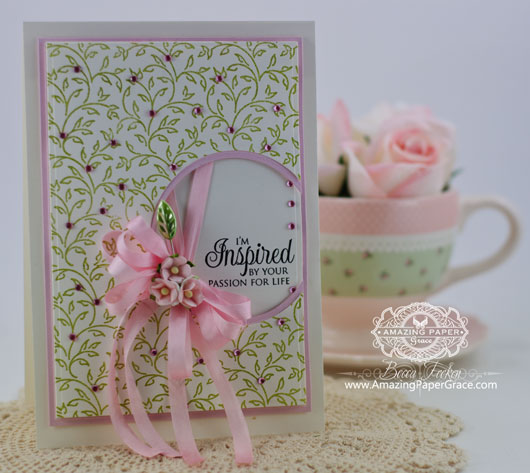 
Hi there blog friends! Wanna peek at two new stamp sets I designed for Justrite Papercrafts? They’re debuting today and the JustRite ladies have made some magnificent examples to show you. I’m holding my hand up and pleading guilty because when I design stamps, I normally design something I’d very much like to have in my own stash. I love it when I’m tempted to reach for a set more than once so I try to design things that will get as much mileage as possible. The background of my card today is Filigree Leaves Cling Background Stamp. It’s very dainty and delicate and can be left plain or a dot of marker on the leaves. It looks so sweet embossed. The main purpose I had in mind for this design, was to make small swatches of wrapping paper for jewelry, soaps and candles – small things. The sentiment is from What I Life About You Clear Stamp Set – another set that you can personalize for all the loved ones in your life.
 
My card today is simple (I didn’t want to cover up that background) and uses basic dies you probably already have in your stash. I used Spellbinders A2 Matting Basics A and Spellbinders A2 Matting Basics B along with Spellbinders Standard Circles SM cut on the right side of the card bordered with Spellbinders Standard Circles LG. I sprinkled the background with pink gems for flowers.
Here’s your Step-By-Step Recap, from the bottom up, just in case you’d like to make one too. Start out with a cream card base cut to 5-1/8″ x 7-1/4, foam tape, die cut from pink cardstock later from A2 Matting Basics B #6, cream scrap with stamped sentiment, foam tape, die cut scrap with Standard Circles LG #5 (use negative), die cut layer from stamped background cut from A2 Matting Basics A #5 and before placing, cut using Standard Circles SM #6.
| SUPPLIES I USED |
Stamps: Justrite Papercrafts – Filigree Leaves Cling Background Stamp,
Paper: Neenah Classic Crest Natural White, Coredination
Ink: Amuse Studio – Fern, Versafine Onyx Black
Accessories: Spellbinders A2 Matting Basics A, Spellbinders A2 Matting Basics B, Spellbinders Standard Circles SM, Spellbinders Standard Circles LG, Recollections Gems, May Arts Silk Ribbon, Maya Roads Leaf Pin, Becca’s Bow Maker, Grand Calibur Die Cutting Machine |
I hope you can peek in and see what the others have created with this set as well.
JustRite Inspiration • Becca Feeken • Kellie Fortin • Darsie Bruno •Barb Schram • Kathy Jones • Eva Dobilas • Debbie Olson • Heidi Blankenship • Angela Barkhouse • Marisa Job • Kristi Schurr • Michele Kovack • Margie Higuchi
Thanks for stopping by, I’m so very thankful for each of you!
 
Posted in *Matting Basics A - A2, *Matting Basics B - A2, *Standard Circles LG, *Standard Circles SM, -For A Friend, :Cream, :Green, :Pink, Retired Products, Stamping, |Classic and Simple
 
Sweet blog friends, I’ll have to explain todays twofer :-) I played around with Spellbinders Cabbage Roses embossing folder and had so many iterations using different inks and techniques, that I decided to use up all my scraps today rather than try to double back and use them another day. I used the same dies for both card but they have different looks. One is a portrait oriented card that is very feminine. The second card is a landscape orientation and it’s as close to masculine as I can get, lol. Yes, I fuss over masculine cards and add bows and such and up until I hit publish, I was trying to add something to this card because it seemed plain, but the textured background wouldn’t allow me to add anything else. For both cards I reached for elegant sentiments from Quietfire Design – I Wouldn’t Have Missed Being Your Friend and You Never Know How Strong You Are
 
My first card (pink) is fairly simple, I started out with the Spellbinders Cabbage Roses folder embossed with one side of the inside of the folder inked. I built up the next layer with Spellbinders Bird Cage Two which gave me a loop at the top of the design. I followed up with Spellbinders Classic Ovals LG followed by Spellbinders Labels Thirty Two and ended with Classic Ovals LG embossed with Spellbinders Gold Ovals One.
 
For my second card, I love the little loops on the ends of Spellbinders Bird Cage Two, so I used two of them mirrored , as my base die layer. On top of that I added Spellbinders Labels Thirty Two and followed up with Spellbinders Ovals LG. I impressed the cool embossed pattern into the oval using Spellbinders Gold Ovals One, an enhancing element. For embellishment I added one of the Spellbinders Media Mixage Ovals One bezels filled with crystals and glued to filigree; I glued this unit to the center of my bow. Lastly I had a square piece of filigree that I cut in half and molded around the edges.
 
Here’s your Step-By-Step Recap, from the bottom up, just in case you’d like to make one too. Start out with a card base cut to 6 x 7-1/2″, foam tape, matting layer 5-1/2″ x 6-7/8″, design paper 5-3/8″ x 6-3/4″, foam tape, matting layer 4-3/8″ x 5-3/4″, layer embossed with Cabbage Roses 4-1/4″ x 5-3/8″, foam tape, die cut layer using Birdcage Two, foam tape, die cut layer using Ovals LG, foam tape, die cut layer using Labels Thirty Two, foam tape, die cut layer using Ovals LG embossed with Gold Ovals One. (Instructions are same for the masculine card except omit the first Ovals LG).
| SUPPLIES I USED |
Stamps: Quietfire Design – You Never Know How Strong You Are, I Wouldn’t Have Missed Being Your Friend
Paper: Neenah Classic Crest Natural White, MME
Ink: Victorian Velvet Distress Ink, Versafine Black Onyx, Brushed Corduroy Distress Ink
Accessories: Spellbinders Cabbage Roses, Spellbinders Bird Cage Two, Spellbinders Classic Ovals LG, Spellbinders Labels Thirty Two , Spellbinders Gold Ovals One, Recollections Gems, Recollections Pearls, May Arts Silk Ribbon, Becca’s Bow Maker, Grand Calibur Die Cutting Machine |
Hope you are having a blessed week! See you soon!!
 
|









Oh Becca, this is soooo gorgeous, and even I normally would never go for a brownish color like this, I have to admit, I absolutely LOVE this one. I totally agree, I also do my best work ever, when I just let the process take me, where it wants as I go, so I know exactly what you mean, and this has taken you to the top, that´s for sure. Stunning work, just stunning. I sooooooooo LOVE it.
I love that soft color. Beautiful card.
Have all my supplies for simple, elegant boxed card gift set and am so anxious to get the tutorial. Was trying to be patient, but want to make 15 sets for Christmas tuck ins. Is it coming soon?? P.S. The birthday card is beautiful. Check your site daily. You are incredibly creative. Blessings.
beautiful!!!! JUST BEAUTIFUL…
Becca,
Another lovely card. I would like to make it, but sometimes it is difficult for me to see how all the die cuts fit together. I look them all up from your short cuts, but I sometimes can’t see them in the photo of the card. Maybe a photo of all of them on top of each other slightly offset so we can see them might be an idea. I was hesitant to pass this on to you because no one else seems to mention a problem with seeing the layers, but my interest in re-creating these
beautiful creations of yours got the best of me! Thanks, as always, for sharing your creative ideas.
What a gorgeous card!! Love the colors you used!
This is Gorgeous Becca, What a gorgeous colour. Love the Die layers and fabulous ribbon.
Beautiful inspirational work as always.
Hugs Mau xx
I LIIIIIIIIIIIIIIIIIIIIKE THIS ONE BECCA!!!!! IT’S GORGEOUS!!!!!!!! HAS A FALL FEELING TO IT!!!!!!! ABSOLUTELY STUNNING!!!!!!!!:)
ANOTHER BEAUTIFUL CREATION. THANKS FOR SHARING YOUR TALENTS WITH US!
Lovely card; lovely taupe! It soothes and is gentle on the eye. Love to look at this card. It makes me feel good. Funny how cards come together, isn’t it. Whatever make our boats float. In my case, it’s usually the recipient that unknowingly drives the process – colour, purpose of the card, girly or not, etc. Then there is this wonderful time after these decisions, where it suddenly & magically comes together. And I can’t explain the how or why. Isn’t it fun?
I really love this and the Garden Lattice EF is one of my all time faves. As for ‘letting it flow’ I dont really work like that I’m afraid! I spend more time planning and thinking than doing – I am just about to start a version of your Gilded Gatefold Card you blogged in July for our silver wedding anniversary – I have watched your brilliant tutorial several times already and I am sure I will do so some more before it’s finished. I am going to use your baby version idea inside the card with the 3 frames and use a wedding foto on one, a sentiment on the middle one and an excerpt from our Order of Service on the other. I’ll let you know how I get on…… wont be for a couple of weeks though – cant rush these things – ha!
Oooh Becca. That card is so gorgeous and elegant! I love the die layers. I just love how your mind works!!
Wow, Becca! You’ve done it again! This card is so gorgeous. I love the colors, the design, everything about it. So many beautiful creations come from you. God has richly blessed you with an amazing gift of creating beauty.
just one word…………….STUNNING…xx
Such a lovely card.. Very refine and elegant.. Like old money !! You are so blessed with artistic ability and I’m so lucky I found you so I too can try to make beautiful cards… Thank You Becca for Sharing &Teaching all that you do…
I love the card…especially the chocolate color…very different.
Hi Becca, My how pretty this card is…I love the taupe color. Can’t wait to look in my stash and see if I have ANYTHING that color. If not, it off to JoAnn’s. As always you don’t disappoint. So many pretty ideas.
I just love your lovely cards. Can’t miss a day without seeing them. Thank you so much for sharing your ideas with all of us. God Bless you and your
family.
Hi Becca! Your cards are BEAUTIFUL! I love it when I get an email reminder to check out your site!
This card is stunning!!!!!
SUCH A NICE CLEAN BUT UPLIFTING CARD. I LOVE IT WHEN YOU USE THE BROWN TONES. THIS IS JUST SIMPLE BUT EXQUISITE!!
HUGS,
MSTGANE
ANN
I appreciate the comment you made regarding “feeling authentic” to yourself as you create a card. I am not sure I found my niche or my style yet as I am experimenting with all the media out there but I find I am attracted to the “lovely and feminine” style. Having never seen a cutesy card you made I am wondering if you have tried those a few times and dropping them for the more ornate style you stick with. Thanks also for mentioning that you start with dies first and build on them. Maybe creating ones style starts with a die, a color, a flower, a theme; some main way of starting to pull it all together. All things said, I love the chocolate brown colors, the gorgeous bow and the embossed background that compromises this card. Really lovely.
OH MY THAT LOOKS GOOD ENOUGH TO EAT. REMINDS ME OF CHOCOLATE. FABULOUS JOB YOU HAVE DONE. XXX
Oh, Becca, this is so beautiful! I love the earthy colors–my favorite! Thank you, for sharing and inspiring! Cynthia
Hi Becca
Absolutely ……….STUNNING ………. love your bows too.
Love Marion x
Hi Becca, Just love this, so subtle yet elegant. I agree, sometimes when we just play, something really pleasing results. Thanks again for sharing,
Margaret (Scotland)
Becca, That card is so elegant. Love the layout. I always wonder how you mail your cards or do you hand deliver them’
Gorgeous as usual! I really like the colors on this one, it fits so well with the fall coming up.
Am loving the coffee and cream combo! Beautiful as always!
Hugs
Anne (UK) x
Love the colors and you have built this so beautifully. My first impression was “here is a man car.” I have such difficulty making a man card, lol!
This is just so beautiful! LOVE!
Becca, your card is absolutely stunning! I really like the putty colored card stock. I have never seen it before. Great colors.
Gorgeous card! Love the colors.
Oh, I love that putty colored paper!! I hadn’t realized my May Arts ribbon would match that color of paper so well. The card is a delight; simple yet elegant… no surprise coming from you, Becca…
I had to come back for a second gaze at this stunning card today. I love the colors, design. I realize you must be a mathematician. Your cuts are always precise and your designs are always to scale. You amaze me.
It’s a beautiful card, Becca. I’m afraid when my mind has gone blank I just take a break for a few hours and do something completely different. But then I can afford this luxury. Must admit, it doesn’t happen often, just when I’m doing 60 Xmas cards!
Hugs, Rose
great card love the embossed background and the dies used.Go really well together ,Laura O
Oh Wow!! Absolutely stunning. Love the colours and everything about this card. I will definitely try to make one like this. Thank you for sharing.
Hugs Sue x
Morning Becca, I love this !! the colour is beautiful and the die-cuts are really lovely, and the sentiment stamp is gorgeous, the embossing folder is really pretty, and the bow is stunning !! I love it.
Lots of love from Patricia xx
Beautiful stunning card Becca – I love the taupe and cream together – so elegant. The layers of dies are so effective. I’ve recently tried layering more die cuts on my cards and I find it makes for a more interesting finish. Thanks for all your inspiration.
Hugs
Heather (UK)
x
One word….. Classy.
Love the color, Beautiful embossing and such lovely layering to show the embossing off!
Beautiful card and I love the putty colour
Hey Becca, Gorgeous card!!! I am a little bit curious though, about the paper you are using. You have the putty paper listed as EK Success??? I believe this is the second time I have seen you list it, but when I google it, nothing seems to come up. I loved this putty color, and also the peach color that you listed on a previous card. I had no idea that EK Success made card stock or any plain paper. Could you elaborate on this please.
Thanks,
Marcie
I love your card. It would be a great masculine card.
Hi Marcie (comment # 44) – Yikes I googled it and didn’t find anything either. That sent me back to the label that I got the name off of and I see that it is Martha Stewart paper (through EK Success). I have tons of this and I’m beginning to think it has been discontinued. Sorry :-(
Love the vintage colors, soo elegant!
This card…..wow! So classy and elegant! I love the bow and the the multi-color leaves. All gorgeous!
Blessings,
Michelle
Stunning! I love the colors.
I adore this card! It’s my style too. I also work around my die cuts too. I love the colors you used even though they are neutral and not the pink I also love! I learn so much from you Becca!
So elegant Becca.
OMG, this is stuuuuunning!
Dear Becca, oh my word what a stunning card this is, I love everything
about it, It is so reagal looking and I wish I had just a fraction of your
marvellous talent, thank you for shareing your talent with us
kind regards Christine c.