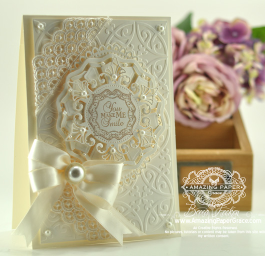 
Hello there blog friends! You know how much I love tone on tone, so today I tinkered around to see how far I could take it. Except for the taupe ink, I think I stuck to the plan! Cream is my go to color but whether cream on cream or white on white, tone on tone makes my heart sing. It’s funny because when you take the design paper out of the equation, things get easy for me – not too many choices to make. My inspiration was this new stamp set by JustRite Papercrafts called Botanical Swirls Labels. I started out with a 5 1/2″ x 7 1/2″ card base and since I wasn’t using design paper, I thought it a perfect opportunity to create texture with an embossing folder – Spellbinders™ Ornamental Iron. On top of the texture I layered the smallest template from Spellbinders™ Grand Decorative Ovals One. Moving up on the stack, you might find this odd, but I loved the dimension added by a Cut, Fold,and Tuck Die – this one is Spellbinders™ Carnival Dream. Okay, just one more layer (like jenga) . . . on top I positioned the largest template from Spellbinders™ Venetian Motifs.
 
Pearls bring just a little bit of a warm glow to the buttery hues of cream.
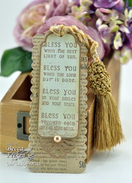
And then, because I very, very rarely have anything masculine to show, I set out to make a masculine bookmark. As much as I wanted to, I resisted the urge for tons of layers – I mean the book has to close, right? If there are layers and lace and bows, I’m afraid it defeats the purpose and perhaps doesn’t get used. I found a dark, distressed paper and paired it up with a hefty tassel that I got somewhere on ultra clearance. I sneaked in one pearl and one embellishment but I wouldn’t hesitate to give this to one of my guy friends. “Manly yes, but I like it too” (don’t pretend you’ve never heard that commercial old timers – I’m showing my age aren’t I? LOL!
My heart goes out to the folks over in Lousiana; hoping tomorrow finds you safe and sound. In the meantime, thanks for stopping by today!!
 
 
Hello there blog friends! It’s been so busy lately that I haven’t had a chance to play. Even though I could count the hours I had free today, I made way to the craft table to fiddle with an idea I’ve had for a long time. When I was a girl one of the pieces of art on the wall at home, that made it from house to house, was a shadow box.
  The frame of the box always stayed the same, but over time, as we moved, knick knacks were added and knick knacks were taken away. I think that was when I fell in love with frames and shadowboxes because no matter what the trend, the contents made it new again. That’s one of the things I had in mind when I designed the Two by Two Postage Die. The four frames remind me of that shadow box, and I thought about all the different things I could fill them with. I’ve been itching to sit down to the table and add some layering to the frame using lots of the the things I already have in my stash; as you know I have a little addiction to layers, lol! I know someone will email to ask so . . . the Two by Two Postage Die and stamp set are a part of the Amazing Paper Grace Kit Club available HERE. The kit is available as a Club Membership however each month a few kits are produced above and beyond what’s needed for club. It’s not a guarantee you can get these extras each month, but there are still some left HERE. If you’re on the fence and just want to give it a try . . . just sayin’. Okay let me get to how I put these two very different cards together. The frame of the box always stayed the same, but over time, as we moved, knick knacks were added and knick knacks were taken away. I think that was when I fell in love with frames and shadowboxes because no matter what the trend, the contents made it new again. That’s one of the things I had in mind when I designed the Two by Two Postage Die. The four frames remind me of that shadow box, and I thought about all the different things I could fill them with. I’ve been itching to sit down to the table and add some layering to the frame using lots of the the things I already have in my stash; as you know I have a little addiction to layers, lol! I know someone will email to ask so . . . the Two by Two Postage Die and stamp set are a part of the Amazing Paper Grace Kit Club available HERE. The kit is available as a Club Membership however each month a few kits are produced above and beyond what’s needed for club. It’s not a guarantee you can get these extras each month, but there are still some left HERE. If you’re on the fence and just want to give it a try . . . just sayin’. Okay let me get to how I put these two very different cards together.
 
For my first card, I used some sweet elements I’ve had sitting on my desk for months. I thought they would make a great shadow box. I didn’t feel like I had to fill every hole, but I took one of the stamps from Signed, Sealed, Delivered and used it as the focal point for the shadow box. I added two layers of foam tape on this one to give it extra depth; I decided I like the two layers best. On top of the rest of the frame, I added some Kaiserkraft pre cut elements from their Sweet Nothings set. The gathered trim on the bottom was Michaels clearance, that I’m so glad I finally used, lol!
| SUPPLIES I USED |
Stamps: Amazing Paper Graces Kit Club – Signed, Sealed, Delivered (manufactured by JustRite Papercrafts)
Paper: Neenah Classic Crest – Natural White, The Paper Company, Coredinations
Ink: Amuse – French Roast
Accessories: Amazing Paper Graces Kit Club – Two by Two Postage Die (JustRite Custom Die/Spellbinders Compatible), Recollections Trim, Kaisercraft Sweet Nothings, Seam Binding, Spare Parts Brad
|
 
I have another card to share today, even easier than the first. If you have some design paper that’s calling you name because of a unique themed element – then shadow box it! That’s what I did with the new Graphic45 Ladies Diary paper that I’ve had sitting on my desk. There’s no doubt that I’ll find a use for every sheet in that pad, but the first was to cut out some of the vintage fashion and include it in a shadow box. Now on this one I only used one layer of foam tape behind the Two by Two Postage Die, but it still creates a shadowbox effect. Then the layers come in – behind the frame I offset two panels using Spellbinders™ Decorative Labels Eight then backed it on a card base made using Spellbinder™ Grand Labels Twenty Three.
 
I wove silk ribbon through the holes of the die cut then tied to the side with a bow and added a corsage pin. On top of the bow I plunked down one of my favorite Jolee’s flowers that has burlap, silk flower and a brad all together! I picked the simple sentiment from the Signed, Sealed, Delivered set and cut it out with the little tag die that comes with the Postage Die.
Thanks for indulging me – it’s honestly the first opportunity that I’ve had to play. I actually created two more (very simple) things I’ll show next week – hurricane willing. In the mean time, hugs to you all, thanks for stopping by today!!
 
 
Delightful, that’s what it is! There is nothing more delightful than to show up . . . cut where you’re told to cut, glue where you’re told to glue and stamp where you’re told to stamp. Then shazam – you’re done! That’s what I did today! All the credit goes to Claire at Waltzingmouse Stamps! This is exactly what my brain needed and the huge bonus is that I have the sweetest little gift to give to one of my friends with a penchant for gardening. So, welcome to the August Blog Waltz for Waltzingmouse – this week we’ve been previewing a slew of enchanting new stamp sets and cut files (don’t let this word scare you, I’ll explain). Here are the sets you can now see in full – here.
 
Vintage Garden Produce
Vintage Garden Flowers
Vintage Seed Packet
Vintage Garden Appleblossom Seeds
Camellia
Opera Tags (and Opera Die Templates)
Little Lanterns
Bright Season
Light of the World Sentiments
 
If you jumped in the middle of our list, the best way to make your way through the hop is to start at Claire’s Blog (she has lots of news to share so you don’t want to miss beginning there) – she has the complete sequence if you get out of order or if one of the links don’t work. If you have just come here from Tosha’s blog then you are in the right place! In order complete the hop, leave a comment on as many of the Design Team Members Blogs as you can as a random name is selected from each blog and then a final winner picked from those names. A winner gets a free set of their choice of Waltzingmouse stamps. You have until August 26th at 5:59am CST to leave your comment and a winner will be selected and shown on Claire’s Blog on August 28th. Stay tuned, below I’ll tell you your next stop along the hop!!
So, for my project today (made in about an hour) I accessed the cut files that Claire designed to go along with the stamp sets. What that means is I used my Silhouette Cameo to cut them out, then I stamped on them and constructed the basket according to the instructions that come alone with the files. The basket template (which is free) was designed to work with the strawberry files we showed over the last month. I knew it would work well to hold the seed packets so I simply increased the size by 1 inch. If you do not have a digital cutter, the pdf files will allow you to print out the files and cut them by hand or with an exacto knife. The seed packet files are available this month – I’ll edit in a link when I have one.
I picked a sweet double sided paper, cardstock weight, when I cut everything out. I used my favorite My Minds Eye papers (that I hoard). Honestly this could not have been simpler and I’m always looking for something quick and easy to give as a gift with a small card that makes me feel like I’ve made an crafty accomplishment. Mission accomplished! Heading into the weekend, I hope you’re able to get the satisfaction of ticking something off of your list . . . crafty or maybe not so crafty!
Your next stop is with Clare Buswell – be prepared to ooooh and ahhhh!
Thanks so much for stopping by, I’ll see you soon!!!
 
|









Love tone on tone. This card would do for any occasion just change sentiment. Good job xxx Looks so expensive but your secret it safe with me lol
Wow what a very beautiful card this is
Super done
hugs andrea
Oh Becca, this is absolutely stunning! I have allways loved tone on toone but you have taken it to another level. Also love that bookmark. A very dearr blog friend introduced me to bookmarks a couple of months ago and I just love them now. They make great little gifts. Love from Christine -in a pretty wet UK but my thoughts and prayers are with those in Louisiana. We had a lovely holiday in the southern states a few years ago. xx
WOW! Love them both Becca!
Absolutely stunning, so elegant and beautiful!
I love this, so elegant!
Gorgeous; both card and bookmark
ColleenB
This is absolutely stunning, would never have thought to do cream tone on tone before, you have such amazing ideas, thank you so much for inspiring others and sharing. Can you tell me what machine you use to cut out your Spellbinders as I have no success with my Cuttlebug and am thinking of buying a Big Shot, would appreciate your advice. Thank you.
You are just too good!! Beautiful creation. Thanks for sharing.
OKAY – – Now you’re talking….my favorite has always been tone on tone,
especiallly —-white or Cream. Annv. cards, no matter what the year
are sooo GORGEOUS done white on white. Very Tender.
Keep ’em coming —Love seeing all your designs and creativity.
Blessings,
joyce
You really have a knack for those tone on tone cards — this is another elegant example. And I really like that that bookmark…fab.
Tone on tone is you cup of tea….gorgeous……and I think any man or women would love to have this book mark….tfs
Beautiful card Becca. Love it!
Becca, Becca, that card is just stunning! love the colours, the lace and pearls and the sentiment….just everythng about it really. My kinda card.
LOL Eileen
Oh my goodness, this is so gorgeous Becca, and I just absolutely LOVE it. This card just looks stunning hun and your work on this one is really outstanding. I just soooooo so love it.
Becca you have outdone yourself on these projects. I especially like the first card. Beautiful! I love how you have combined so many facets to it. Hope all is well your way. Have a great and happy day!
I just love it !
Afraid for the Louisianne
Merci. Francine
Absolutely love the tone on tone. Your card is just beautiful. Love it Love it.
I love tone on tone too, and your card is stunning. I love all the dies, embossing, lace, everything. It’s gorgeous!
Love the bookmark too, that tassel is amazing!
Gorgeous!
Oh My Word! Your tone on tone card is Stunningly Gorgeous!
Ooooh, Becca, what an absolutely GORGEOUS card. Your cards transcend cardmaking into pure art. You do it every time!
Oh my gorgeous! That tone on tone white card is beyond stunning…loads of texture (I love the lace in the top left corner) and visual interest…but very restful at the same time. Design perfection!
Another stunning creation, Becca! I am also a fan of tone-on-tone. Colors are soooooo much easier to match than patterns. Love that little CFT layer. Certainly is “unexpected”!
Thanks for sharing your design with all of us. Gets my creativity sparked!
Oh YES! Tone on Tone is WONDERFUL!!!!!!! And YOU, BECCA do a WONDERFUL JOB with it! WHEW!!!!!!!!! :) Your book mark is WONDERFUL!!!!!!!!!!!!!!! YEP, I’d like that for myself! SOOOOO PRETTY!!!!!!!!!!!!!! :)
Becca,
I love the tone on tone card. I have been experimenting with white tone on tone this summer but I haven’t tried cream. Your card is so elegant. Thank you for sharing!
These are both fabulous. The tone on tone card is so uber-rich looking – it could be hung on a wall as artwork! Super stuff!!
Both are just gorgeous, Becca! I love the creamy layers and pearls and I love the sentiment used on the bookmark. That tassel is awesome too!
Absolutely GORGEOUS!
this tone on tone is just too beautiful jean
Absolutely stunning Becka, so much interest with all those layers.
Totally DREAMY! Love the tone on tone! It’s always elegant and you did it up perfectly!
beautiful tone on tone, elegant. I love your book mark as well. I am in the process of making them for Christmas. Better think again about adding bows, thanks for the tip……have a good day
Exquisite. TFS. Have a great day.
You just continue to amaze!!!! You have so much talent it must ooze out to those around you! Gorgeous card.
Just to say “How beautiful” with the cream card. Nobody does the layers like you do! The bookmark is great as well. TFS
Wow, wow, WOW! That tone-on-tone card is so elegant! I just love it!! All my fave things – lace, cream, layers, ribbon, pearls. Put together with your love and creativity, and out comes absolute magic! The bookmark is also fantastic and I know any guy would use it. Just the right amount of bling to enhance it but not feminize it. You little genius, you!
I love white on white/cream on cream cards and this one is a beauty!!
Becca, these projects are beautiful. I am working on new projects in my art studio and I am sooooo inspired by you. I wish you lived next door! We would never leave our studios! Many blessings to you, as you are a blessing to me!
This is one gorgeous card I will never get tired of looking at. It’s so beautiful. The bookmark as well–I love the sentiment.
Absolutely Beautiful!!
That is an absolutely gorgeous card! :)
Gorgeous card. Dianne
Your tone on tone cards are always amazing – this does not disappoint! I like the book mark too!
Your tone on tone card is STUNNING Becca! You truly are amazing!
Paper Hugs,
Jan
In a word -gorgeous!
Magnificent! So elegant!
Absolutely stunning. I love your tone on tone card. Gorgeous layers and now you’ve shown me another set of dies I NEED to treat myself to. The bookmark is lovely and the words are beautiful too. Alexandra
old spice right? lol that’s one is old, anyhoo… love the colors ahhh to create like you, you are my inspiration thanks for all you do to color my world.
Big hugs!
both the card and the bookmark are gorgeous!! I wish I could come up with all the ideas like you do, lol. seriously tho, I really like looking at your cards and creations!
They are both fantastic i did try and make a white one today but it didn`t end up that way .melanie
Beautiful card and very handsome bookmark!!
I just love what you have achieved with your cream on cream creation It is so elegant Just wish that I had just a part of your vision!
Stunning, so beautiful in every element, wishing you a great success on your new business adventure. Hugs, Lori m
Lovely card, where did you get that ribbon?
love the tone on tone and your creativity, would love to be a wee mouse and sit on your shoulder and just take it all in! Bless you Becca
Just beautiful, Becca! Love that tone on tone card!! So elegant and a real feast for the eye!
Your tone-on-tone card is absolutely gorgeous Becca. Love the masculine bookmark too!
In my home town of Cincinnati, OH there is a candy store that makes a seasonal candy called “Opera Cream”… that is what this card reminded me of… that fabulous, smooth, creamy yummy-ness. Both of these are lovely!
Gorgeous!
Becca,
The tone on tone card is quite stunning and you’ve inspired me to try this technique. It produces such a gorgeous effect! Thanks for sharing your talent.
All of your creations just blow me away., They are absolutely gorgeous,. I have one quick question for you…Do you actually give these cards to friends, relatives, etc. or what do you do with them?
Love the tone on tone. Gorgeous!
BECCA FELL OFF MY BIKE AND FRACTURED MY HIP. TODAY I FEEL
LIKE PLAYING COMPUTER.HUSBAND G. OT ME NEW EMAIL SO I AM
TRYING TO FIND YOUR DAILY BLOGGS. TODAY IS FANTASTIC.
BUT I DONT HAVE ALL THE DIES YOU USE IT IS BEAUTIFUL AND
CAN BE USED FOR MANY OCCASIONS.
Beautiful, Becca!
Fabulous! Breathtaking! I am in love with your cream on cream. It surpasses beautiful.
Great guy bookmark and Gorgeous tone on tone, love all the cuts!
How gorgeous!
Be still my heart !!!!! This is jaw dropping beautiful…wow…
Love the tone on tone and forget to do that more often.
Love the simple bookmark as well.
Your work,Becca, is outstanding! Stunning, gorgeous and my dream is to make a card like Becca!!!! Don’t think it will ever happen!!
You have been blessed with an incredible talent for creating beauty. Viewing your card creations is like looking at a garden – so much beauty that it makes you want to linger longer and return often. Thank you so much for sharing your amazing art.
Priscilla