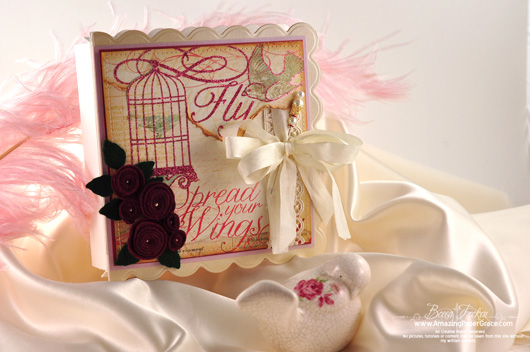

Hi there blog friends, during a Spellbinders release last month, I was so tickled to share a project I made with some of the new die templates that had been sent to me. I have to admit that it’s probably my most favorite project to date and believe it or not, I am my worse critic, but I savored every minute of making this. It was a quick creation and most of the leg work has gone into picture taking and tutorials. I don’t have the project as someone actually won it, but I want to work along side you, to recreate that project. Now I read comments all the time and sometimes I’m surprised when people say they could never make some of the items I make. To that I say “fooey”. If I can make it, you can make it. I slowed down and took my time to put these tutorials together because I want them to be thorough. I challenge you to give them a try.
I’ve broken the tutorial down into three parts, because there are basically three pieces and so that the tutorial isn’t too long. There is a card, a box and the inside of the card is a pop-up; each part exists for a reason. The gift card exists to reveal a pop-up and the card has to be at least the size I specify or it will not work. The gift box portion I added on because I layer my cards. In order for the card to lay flat when opened so that the bird cage will fully pop up, I needed to elevate the card to allow the opened card to lay level. The pop-up is the main attraction. There are a few steps to put it together, but if you follow them one by one, you can make it too. I’ll get started by sharing the list of products I used. You can find them in local craft stores or by googling to find them online. Because I’m working on some tight deadlines behind the scenes, I encourage you to google the items I’ve used if you are trying to find them.


| S5-033 Spellbinders Bird Sanctuary |
Lace |
| S4-329 Spellbinders Butterfly Circles |
Seam Binding (Hug Snug) |
| LF-127 Spellbinders Grand Scalloped Square |
Felt – Green and Burgundy |
| S4-328 Spellbinders Foliage |
Pearls – Recollections (Michaels) |
| S4-114 Spellbinders Standard Circles LG |
Pearl Stick Pin – (Joann’s) |
| My Minds Eye – Adore Fly Away Paper (HL) |
Prima Lace |
| My Minds Eye – Lovely Shabby Chic Paper (HL) |
Scor- Pal |
| Antique Linen Distress Ink |
Scor-Tape – 1/8″, 1/4″, Sheet Tape |
| Vintage Photo Distress Ink |
Velcro Dot |
| Coredinations Tan Pearl |
Colorbok Metallic Paper – Gold Foil |
| Coredinations Lavender Pearl |
Strathmore Linen Canvas |
| Coredinations Scarlet Pearl |
Sewing Machine |

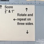
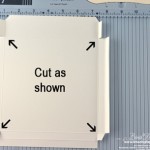
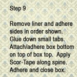
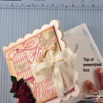
(Click images to enlarge)
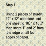
Thanks so much for joining me for part one of the bird cage tutorial. Remember, your card has to be at least the dimensions I’ve given you and it really needs to be a sturdy, sturdy cardstock. Now wasn’t that manageable? I’ll be back tomorrow with Part 2!

 .
.
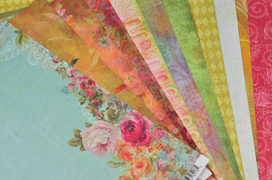















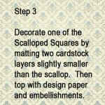
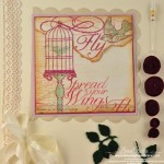
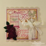








I love doing shabby pages and cards and one of my favorite palette of colors is pink, white, gold and cream.
Thanks for the blog candy!
I love shabby so my favorite color palette is presently pink, white, gold and cream.
Thanks for the blog candy!
Wow – I love prima paper – thanks. My favorite color palette is pink and brown.
Have a great weekend
Janet
Gold, burgundy, and cream are my favorite colors together. So rich and regal, and perfect for holiday cards too.
I wish I could just wallpaper my house in that cardstock! So lovely and happy looking. :)
Gold, burgundy, and cream are my favorite colors together. So rich and regal, and perfect for holiday cards.
Beautiful papers , Becca !
Beautiful papers, Becca !
Wow, beautiful papers! I’ve been liking the pink/black/white color combo lately. Thanks for the chance to win :)
~Rachel in Sacramento
Wow, I am the first my favorite color palette lately is light teal and pink.
Sweet candy, Becca! Right now I am enamored with pinks and browns. :-)
Becca, I am loving your new creations and so enjoy your blog. Keep up the great work, tutorials and Becca bits. My favorite color palette at the moment is brown and blue.
God bless,
PeggyS
More gorgeous papers Becca, and these are awesome too.
I must admit, I have several, but one I´ve used a lot lately is burgundy and pink and gold. I just love these colors together.
Have a wonderfil week-end dear friend and thanks sooo much for your generousity always.
They are beautiful papers just like your gorgeous work, and you are so generous with the candy, thank you so much for the opportunity
Hugs Kate xx
As a paper addict I would just love to win those beautiful papers!!
More beautiful paper! I like the black and white with silver colors together.
I think I love the blues..living on Cape Cod, they are water and sky to me. I also do papercast shells and the blue backgrounds look wonderful with the shells.
What beautiful paper! All your cards are beautiful and I look forward to seeing your creations every day. I think you are amazing!!! One of my favorite color combos is black, teal and white. Thanks for all you share!
I iove peaches and cream, maybe with a little soft mossy green thrown in!!!
Thanks for the chance to enter, and for continuing to show us so much beauty with your creativity!!!
Hi Becca,
How sweet of you to offer such LOVELY candy!
My favorite color palette is pink/black/white…I think it really adds an elegant feel to my cards and projects!
Hope you’re having a wonderful weekend,
Barb
My favorite color combo is jewel tones, I think that is why I would love to win this sellection love the colors!
Thanks for another great giveaway Becca. I love pastels.
Enjoy having your computer back. I know how frustrating it can be without one.
I looked at my recent cards and I guess my favorite palette is pink, gold brown and ivory at this time. When I scrapbook I try to find a color in the pics I am using and go from there.
Hi, Would love to win your beautiful paper. My favorites would be shades of purple and lilac with vanilla and a hint of the right shade of green. I prefer lighter tones to the dark ones. Thanks. Edna
I would love to win the nice paper.
Hi Becca, WOW more candy? What can I say, I love love the papers!
Do I really need more paper??? LoL , Of course I need paper! I am a card maker and scrapbooker. Never have enough gorgeous paper. The one thing I really love about getting more paper is …… It is never out dated lol.
My favorite colors just now is light green and white. Summer colors?
I love color, so my favorite combination is anything that will go with red……….. pink, purple and of course black and white.
Gorgeous papers, love all these.
Hi Becca, I think i like all the fruity sounding color combo’s like………
Raspberry / Peach
Vanilla / lime /chocolate
Thinking of these fruity colors, inspires me !!
Hugs
chris richards
xxx
Oh I would love to win those papers they are so beautiful, what fun they would be to use. I love everything you do, you are a very talented lady.
Gorgeous paper!! Love your candy!! I love to use blues they are my fav!!
Hugs
My favorites just now is light green and white.
Becca, I love paper. I love to look at it and love the colors in all the different paper designs.I love to own it and then it’s hard to use it. Right now I seem to be using pink & green a lot.I would love to win this paper.
Oh, dear.
I do like so many.
Yellow, purple & green.
Would love the paper you offer.
So very kind of you to do this.
mary l.
What gorgeous paper!!! I’d give it a good home. Thanks for your continued inspiration.
Hi Becca! One of my faves is soft yellows and pinks. Thanks so much!
My favorite color combination is, yellow, pink, and green…..in any tones…light, dark….ect….tfs
What pretty papers! A color combo that I have enjoyed using lately is green, pink, and a touch of brown. Was not sure it would work but I like it. Blessings.
Hello Becca – thank you for the opportunity to win this divine DP – I have never used Prima before! Like you, I am not at the Post Office that often – so waiting would not be an issue! LOL! Thank you for sharing! I have had you on my heart this week and have been praying for you! God bless you Becca! {{{hugs}}}
What Beautiful papers. Wonderful blog candy as well. My favorite combo is black white and red or pink
Thank U 4 this opportunity.
ColleenB.
What beautiful paper! I tend to lean toward lavendar, soft green and turquoise for a color palette. So calm and soothing. And with the right paper….outstanding!
This is a gorgeous paper collection! The colors I usually steer toward are in the blue family…. from aqua to periwinkle and navy. Thank you, as always, for providing such wonderful inspiration!
The paper is beautiful! Today I like brown and pinks and/or greens.
Hi Becca! I love the color combination of browns and aqua. Although I do love all the colors of the Prima papers in your giveaway. Thanks for your generous spirit.
Beautiful paper,just love it!
Becca:
I’m sure part of the reason your cards are so gorgeous is this beautiful paper you use. Maybe if I win I can make great cards too!
Primapapers are some of my favorites, these are gorgeous. Thanks for offering! As always I love your work, thanks for the inspiration.
I can just imagine using some of these beautiful papers on cards. Thanks for offering them as blog candy. Love your elegant cards.
Wow…I would love to have some new papers to work with.
Thank you for the chance to win.
I love your blog.
Cheryl
Becca
I find my palette seems o change with the season. I find myself reaching for yellow, lime green and bright turquoise. I see thesee colors working well with the candy.
Sharon L
Thanks for the giveaway.
Beautiful paper….I can imagine the cards I could make with this paper…thanks for the chance!
The prima papers are gorgeous, Becca. My favorite color palette
is definitely rose/mauve, green and tan. Thanks for the chance to win
the papers.
Blessings, Pat
My favorite colors for scrapping are browns with either blue or green. This is due to the fact that my husband and son wear blues and are usually outside for photo ops. Thanks for the chance to win the lovely papers. I like to have some “girly” looking papers, too!
I like pink and green for a pallette. I love tiny roses on paper and small Victorian prints.
I love waiting to see what beautiful work you have for our viewing on your site. Your work is amazing and I enjoy seeing it. We appreciate it.
Tricia Jones
Opps for got to tell you I like working with white and black.
Cheryl
Oh Becca; you are generous beyond belief! Love those Prima Flower papers! I seem to have a preference for anything green, but also love the browns with aqua. I have a great time deciding which colours to work with each time I start a new project.
i love anything paired with brown! really digging the softer side of that right now paired with soft whites and creams and khakis.
thanks for the yummy prize!
I love pinks, purples, greens and browns. Love your blog – very inspiring!
i love brown so anything with that is a favorite. really digging the softer side of that right now with soft creams, whites and khakis.
thanks for the yummy prize!
Thanks for the opportunity to win this beautiful paper. I love the earthy tones, brown, mauve, rose.
Beautiful papers! As I looked at what you have photoed, I could not help but think of my church friends who get together to do create cards for our soldiers. The papers you are showing would make lovely backgrounds and accents for the soldiers’ notes home. Whoever receives these will have a great time creating!
Good luck everyone!
Love Prima papers. My color pick changes often, but always love pink and brown tones.
Please enter me into this contest for the Prima papers. Beautiful, they are!!!
i like to experiment with color combos, but have recently been fond of pink and chocolate…thanks for offering the blog candy!
Becca, I really like how you are breaking up this latest tutorial. I can’t wait to finish up and see the birdcage actually pop up!
Love these Prima papers too. I’d love to find that pink paper somewhere. I want to use it as a background for a canvas project I have in mind.
Here’s to your productivity……don’t you just love it when you can get things done? You go girl!
My favorite are the pastel. usually something with flowers on them. I’m a sucker for florals. Good luck everyone. As always Becca, TFS!!! ;-D
HI Becca
Gosh, my color palette seem to change every time I make a card or see a card that has been made. These papers look wonderful. I would be so happy to win and color combo. Thank-you for a chance to win,
Hugs
Monica M
Oooo! I love all things Prima. Right now I am gravitating towards peach, apricot, and ivory.
This paper represents my favorite palette – bright colors with a warm cast! Lime greeen, gold, coral, aqua, a touch of hot pink! I have been longing for this paper, so it would be a dream come true to win some!
DEAR BECCA YOUR BEING A SWEETHEART AGAIN WITH THE PAPER
CANDY BLOG. AND THANK GOODNESS, AS I AM SURE THERE ARE A
LOT OF CRAFTERS THAT CANNOT GET THIS BEAUTIFUL PAPER. MY
COLORS ARE PALE PINK, ANOTHER IS PURPLE AND I LIKE A VERY
LIGHT, PALE GREEN. THANK YOUAGAIN
HUGS CYNTHIA
I am glad we can leave a color pallete each day because I have several that I like really well. One of my favorites is a lavender to purple with sage green. Thanks so much for the opportunity to play yet again. It’s fun to see what other color combinations are out there :) Blessings!
thanks for another chance at getting my hands on some more amazing stash.
Bleesings and smiles
Paola
Oh so beautiful :)
Thank you for the chance of winning this :)
Do have a blessed weekend and holiday.
Hugs
/Inge :)
I love soft green, brown and pink. I love this paper every one of their ranges is beautiful.
Janette P
Hi Becca: I can just imagine using these beautiful papers on cards – not up to the elegant standard you set, unfortunately. Thanks for offering this blog candy.
Love these Prima papers and my colors are greens and blues right now. Thanks for the chance to win
Lately I’ve been liking pink & brown.
What gorgeous papers you’re giving away. I’m glad your computer is feeling better. :)
Hi Becca! I love soft pink , soft green and cream and a touch of brown sometimes. I like the vintage, worn look of days gone by. Pink with pink is good too : ) Thanks for the chance to win.
Pretty papers! First palette I like is pink, light grey and cream together.
Pink is my favorite color-but I seldom use it because I have boys! LOL
My favorite colors would have to be anything that goes with pink. Thanks for the chance to win some beautiful paper.
Soft dusty peachy pink & sage green comes to mind. Thanks for the chance to grab some of these papers.
Love these Prima papers also my colors for the moment are greens and blues.
Thanks for the fun giveaway – I love the
Prima papers! And…I {Love} pink and Blue}!!!
I LOVE LOVE LOVE these papers. My palettes are happy colors (to me) – prinks, blues, greens, purples and yellows…bright – happy – fun!
I love Prima papers, and my favorite color palette is pnk, blue and green. Thank you for this chance to win these beautiful papers.
Wow. Love the papers, and you are so sweet to share.
Anything flowers, I love this collection & would love to win it! Thanks for the chance to do so!
Love the look of these Prima papers. Thanks for another chance to win the DREAMY papers. Dianne
I am loving Aqua, Red & Cream at the moment, looks great together
These are such beautiful papers–thanks for the chance to win. One of my favorite color groups I use often from SU is bashful blue, perfect plum, certainly celery and vanilla.
Beautiful papers from a blessed and beautiful woman. Thanks Becca for all you do.
Oh, gorgeous papers! Thanks for the chance to win. I have been using a lot of blues and browns or blues and greens recently.
Love those papers! My favorite color combos are pinks, purples, and greens. I also love red and tan.
I love the soft colours and muted tones best but some pics just sceam for brights and primarys. They are few and far between in my albums though and that fact really makes them stand out! I suppose a whole album of brights would just make me feel nauseous. :D
Thanks for sharing and hope you have a great weekend! :)
What sweet blog candy! I could have some fun with all those beautiful papers. I LOVE COLOR!!! It’s so hard to just pick a couple. I’ve been using lots of ivory/ brown with any shade of pink lately. Thank you for sharing your lovely projects, and for a chance to win. Blessings and hugs! Patty W.
I love the soft colours and muted tones best but some pics just scream for brights and primarys. They are few and far between in my albums though and that fact really makes them stand out! I suppose a whole album of brights would just make me feel nauseous. :D
Thanks for sharing and hope you have a great weekend! :)
hi,
always love to stop by your site and see what’s new. my color pallet is definately bold and bright colors. thanks again as always for a chance to win.
Thank you for the give away! My colors change with the project I’m working on :) but purples, blues, aqua with a touch of pink and green thrown in are at the top of the list. Thanks again!
I am definately dreaming of winning these dreamy papers! Thanks for another great opportunity.
I love red and black. Thanks for the chance to win.
Beautiful paper, thanks for the chance. Right now I am in love with chocolate brown and anything that goes with that.
Right now my fav’s are orange and pink. Tomorrow it might be something different.
Hi Becca, Once again, thanks for the chance to get some of the lovely papers. Would be a great surprise to find that I was the winner, but even if I didn’t, still appreciate the opportunity for the chance. It’s always a treat to visit your site each day, to see what loveliness you’ve prepared, and sometimes, even several times a day. Thanks so much. Enjoy your weekend.
Thanks for the beautiful blog candy!
I love pinks and greens as a color palate…
thanks! Jennifer
My favorite color combo is lavenders purples and greens. thanks for the great opportunity to win.
OH my an easy answer … baby blue and brown … all the cards I have made the last couple of months are in that color range. LOVE IT … I guess it is time for some girly cards and pinks!! Thanks Becca.
Ooohh … such pretty paper from one AMAZING gal ;-) Thanks so much for the opportunity to win this blog ‘candy’, Becca!
Hi Becca,
I love working with aqua, cream, white and brown
Back again to morrow :) thanks for the chance to win
Love those Prima papers! I see by your cards, you use a lot of pinks. I have taken to use a lot of creams/tans/beige along with blues.
Hi Becca,
I love working with Aqua, Cream, White and Brown,
thanks for the chance of winning some goodies :)
Prima paper is PRIMO!!! LOVE it! My color scheme is anything vintage. LOVE Tim Holtz stuff. I love greens and blues, but love them distressed.
My nephew is leaving for Qatar in a few weeks for active duty so I am making him some things to take with him. Therefore my color pallette as of late has been red, white, blue and digital cammo.
My favorite has to be shades of pink with tones of white and dusky pink. Funny, I can’t tell if “I” actually like it or I just love your cards!!! You do such an awesome job with pinks, lace, ribbons and stamps!
These Prima papers are Prima!! The colors are awesome.
Love the beautiful Primas – just love COLOR! I think all White or Black & White cards catch my eye first. They are usually so clean looking to me!I’d certainly love to win those, though, to try some other combinations!
My favorite color palette is: JEWEL TONES!!!!!!!!!!!!!! They’re rich & enviting!!! :)
I tend to lean towards blue in everything that I do.
Have a nice weekend!
Patty
I seem to be drawn to muted pinks and sage greens, then earth tones. Thank you for the chance to win!
Thanks for the opportunity to win these beautiful papers Becca.
As to my favorite color palette,….I seem to be in the soft colors lately for the most part, pink, mauve, greens and greens and tend to off set them with a bright contrasting color. When my niece asked me recently what my favorite color was…I couldn’t decide…so I told her anything you can find in a rainbow! lol
Hi Becca, I love color. I love associating mood and color. Today I am so happy and I’m choosing rich pinks, greens, soft white, rose, and tan. I love the way these colors perk up a day with sunshine bright color! Thanks for the beautiful blog candy giveaway!
Gosh, what gawgus papers!!! Thanks for the blog candy opportunity!!!!
Oooh, I love that harlequin piece peeking out there!
Becca, you are so sweet to share your goodies with us! I love using pink and brown and teal and brown. But that’s today! Tomorrow may be something else. It’s all fun!
Beautiful paper colors pink and green. Tks Becca
I have made quite a few cards lately using pink, green, & kraft. I love my kraft paper :). Thanks for the chance to win, Becca – you are so generous!!!
love to see all your cards…I tend to like black & white a lot…also green & blue….you use such neat lace…do you have a special store you get this at…thanks for all your sharing…
Oh, Becca — what beautiful paper. My favorite colors are purple, lavender, mauve.
love you blog ….keep up the good work
My favorite combination is anything with turquoise!
Love designer papers. Melons and deep rose are beautiful together and perfect for the romantic cards that dance in my mind.
Lately I have been going with pink and burgundy or light turquoise and teal. Love them all though.
Gorgeous paper, Becca! Thanks.
Great papers! Thanks for offering them to us. I love black, white and red combo.
What gorgeous papers Becca.Your generousity is unbelievable desr lady.
I love the sage greens,and pinks together,or lavenders and greens for summer colors.But back to traditional colors for fall and winter
Oh my, beautiful papers…I’m drooling on my keyboard, lol. My favorite color combos (for today) are greens and yellows. Mine change from day to day, so love how you have set up this giveaway. Fun! Thanks as always, Becca!
Beautiful papers Becca.I love the soft flow of each one to another.
My favorite colors this year is sage green and pinks together,or lavenders and greens,Mostly florals,but lots of stripes too
I love the papers. They are beautiful. So sad to hear about your computer.
Hi Becca –
You must be happy to get your pc back – LOL! It is amazing how we have come to rely on them. The Prima papers are just gorgeous! You are such a sweetie for doing another blog candy. One of my favorite color combinations are robin’s egg blue, pink, soft greens and lavender/lilac, with bits of cream.
Elaine Allen
For Spring my favorite palette is pink and green. I seem to change with the seasons. This is beautiful paper. I’d love to win it!
Hmmmm….. favourite palette, that is a tough one. I love blues and greens, but also pinks and browns, and blues and browns. It seems that I just love all colors at one time or the other.
I always seem to drift to the blues and greens. Thanks again for sharing your beautiful papers!
My absolute favorite color palette is if purple.
craftymom205 at yahoo dot com
I love that paper – thanks for the chance to win!
I love the blue,white,lavender, pink colors
Thanks for the opportunity to win.
definely PINK
Yeah! Even more Prima paper! They are so beautiful – and, you are soooo generous to give them away! A favorite color palette? Well, that’s tough – because it changes (depending on my mood – ha/ha). But, lately I’ve been gratitating to pinks – all shades.
These are just beautiful papers. I thank you for being so giving. I know God loves you so much. My favorite color pallat is black/green or black/blue or black/purple and then gold or cream as the third color. I just think black brings out the elegant in colors. God bless to all…..denice
Beautiful paper — thanks for the chance to win…
Looking through my albums, I found that I have used a lot of the aqua/orange/brown theme. That may not sound like i would be much of a Prima fan,but I do have a specific project in mind for those floral-y Victorian papers!!!
Hello Becca – I just love your blog. I watch your videos all the time and I have tried to put cards together with your style. I am not nearly as successful!! Your work is just stunning. I have learned that my color pallete is definitely in the pink range. I love all things pink and I love adding either brown or green to pink.
Thanks for sharing all your wonderful creations.
Theresa
Hi Becca, I have been looking for a heavier paper, so would be very grateful
if I had a chance to use them. I am sure they would make beautiful cards.
My favorite color palette is peach and green with cream.
Bless you for doing this.
Sandy J.
My palette colors change often but I love browns and khaki with blues, greens and cream.
Wow! More of that beautiful paper! My favorite color combo is a light amethyst, light green and light blue. Probably use them more than I should. Soft colors appeal more to me than bold, bright ones. Thank your for all the videos and tutorials. I love them!!
I just love all the Prima paper! My current favorite color palette is anything that includes Pink! I am such a pink fan! You always come up with the most beautiful cards, that have such appealing palettes, not to mention the best ribbon adornments ever!!
Blues and creams are my go to colors. Thanks for the chance to win Prima paper. It’s quality and patterns are fantastic. Your site is always an inspiration!
lovely paper….one of my favourite colour combos is pink and green…
The papers are so beautiful. Looking at each sheet entices me to make a greeting card for someone special and pig out on a banana split. I hope your pc works well.
I used to be all about primary colors. I love the bright cheerfulness they give, but lately I’ve been going more for more muted, elegant blues, greens, pinks, burgandies, maybe a little peach. Who knows what I’ll reach for tomorrow! Thanks for sharing your stash, Becca!
My favorite color palette is natural kraft card base with either red and white or a dark pink or turquoise. Geeze… I love a lot of colors.
Thanks for every thing you do. I just love visiting with you everyday.
Take care,
Debvbie
My favorite color palette is natural kraft card base with either red and white or a dark pink or turquoise. Geeze… I love a lot of colors.
Thanks for every thing you do. I just love visiting with you everyday.
Take care,
Debbie
Oh, these are such beautiful papers. My favorite color palette changes almost daily! It just depends on what my card is being created for. I love using blues and browns. I just finished a baby card for my new twin grandsons and that was in the blues, of course. We get to go see them tomorrow and I can hardly wait to get my hands on them. They were born Wednesday, on their parents 10th wedding anniversary. Some present, eh? Thanks for all your gorgeous cards. Your talent just seems to grow with every presentation.
Burgundy and dark beige are one combination I like. Thanks for again for offering the papers as a giveaway. Have a calm weekend.
I love those papers! Your own work is exceptionally lovely at the moment – you are using beautiful antique style lace which is divine. Right: only one colour palette is so hard to choose. I like silver on silver for Christmas; creams and sages in spring; bright orange, vivid blue and hot pink combinations at this time of year, and smoky blues and soft brown tones in the autumn. Getting the colours just right is one of the most challenging tasks for me. Co-ordinated papers are a boon!
I like tourquois, lime, orange, and purple together.
I love anything with pink! Pinks and Black or Brown or green!
Hot pink, black and white are the colors my grand daughter loves and now they’ve grown on me. As a matter of fact, I am making her 15th bday scrapbook in those colors right now!!!!!! Hmmmm wonder what colors she’ll like for her sweet 16th lol! Whatever she choses I’m sure they’re capture my heart as well!
More free paper, can’t wait to see what you have to share with us next.
Becca, You are so very generous. I love blue and green together.
I love the peach and green palettes. Very soothing.
Becca,
I like celery green and peach. Thanks for this chance to win.
Becca~ Can’t say that I even have Prima card stock in my craft room,just their flowers.They are very beautiful. Thanks for sharing.
I just recently made a kind of art deco card with a pink/black flamingo on a turquoise background. It turned out pretty neat. Now I’m looking for other ways to use this color palette.
Would love the chance to win the prima papers. Many beautiful cards could be made with those papers. Thanks
I love your blog! I just wish I had more time to enjoy it; crafting and surfing the blogoshpere is a rare treat these days. If I was to win, I would love any color. Pinks, browns, blacks……I would be just so happy and appreciative to win. Thanks!
I love it I love it my fav paper is prima, and these papers are just gorgeous
You are very kind to offer these.
Thanks
One of my favorite color combo’s is shades of blue, purple and grayed greens. But then I’ve got lots of “favorites” ! Depends on my mood, who the card’s for, even the time of year! Those papers are gorgeous, would love to give them a good home.
Thanks, Becca
R/
Hi Becca..How great to have another chance to win this fabulous paper.. One of my favorite color combos is black and white.
I would LOVE to win these beautiful papers! You SO inspire me!
What a wonderful prize again! Love this paper!
Becca, thanks for the chance to win the beautiful papers. As of this moment my favorite combo is beiges with black or red or both.
ooh you are so generous to share your goodies. i like all colors and usually go with a certain color palette for a stretch of time and then switch to another. currently i have been using shades of purple and lavendar with creams and whites for spring, but that’s getting ready to change.
I’m drawn to brown and _____. Brown and pink, brown and blue, brown and green, etc. But I also love bright colors!
I love pinks and teals with black, white, silver and gold the most but really use any color that goes with what I am making. Thanks for the chance to win this beautiful paper!
love the new prima papers. I like pink, light tourqouise, and dark brown
Hi Becca, thanks for the chance to win some gorgeous paper. You asked about a color palette. Well that is a tough one. For cards, I like the pop of Red, White and Blue but I like the softness of Pink and white. Then I am partial to Pale greens and pinks. Oh and lets not forget soft yellow and purple. I guess I just like them all.
Hi Becca,
I love every shade of pink, from champagne pink to the deepest burgandy’s.
Love the beautiful paper give away chance.
Thanks
Bonnie
WOW another give away, how generous of you. . . .my color palette does seem to change, tho I tend to stick with purples, pinks, cream. . . .I think I’m a seasonal color person. . . .I also see a trend in my flower beds too. . . .
I love lime green and orange as contrasts!! but as a palette I tend to stay with blues of all hues.
Thank you for your generosity in offering all the give aways.
Blessings
Hi Becca! Gorgeous papers!! thank you so much for the chance to win them. My favorite colors right now are pastels, mainly the shabby colors. Love your work and thank you for sharing.
Wow! I don’t think I have a favorite. I love so many colour palettes!
Thanks for the chance to win some Prima!!
Hi Becca,
What beautiful papers!!! Love your blog. I would have to say my color pallete is tropical. They all fit into this category!!!
Joan!!!
Gorgeous papers! Thanks for another chance at goodies. I have several favorite palettes… it sort of depends on what I’m working on. A rich aubergine and cream is one I frequently turn to. And then there is the shell pink and yellow-y greens with white or cream that is kind of a constant favorite. Oh! and then there is the dramatic deep ash gray, hot pink and cream combo that I find striking. I did a card recently for my niece in her fav palette, and really enjoyed working with the colors so I may use it some more – it was taupe, robin’s egg blue, and cream with some turquoise/teal accents. I just love colors. Period. Sometimes I’m in the mood for strong jewel tones and other times I lean more towards pastels. All of the colors and the tone and mood they convey are simply fun to play around with. Maybe I was a color wheel in a former life!
These papers look absolutely divine. Thanks for offering such great blog candy. Kindest regards kendell
I don’t think I have a color palette. I love them all. Sometimes I feel bright and sunny, other times I like a soft pastel approach. just depends on my mood. thank you for the chance to win this beautiful paper.
I love kraft and just about any color with it. I love white stamped on kraft. Thanks for a chance to win the pretty paper!
beautiful papers!!! thanks for a chance to win!!!
Hi, one of the color combos I like is pink and lime green. thanks for a chance to win again!
Thank you for all your so very helpful tutorials lately. Thank you also for your generous giving of yet another group of wonderful Prima paper.
very pretty paper-so many things to make & not enough time,lol
Long live the new motherboard! Aqua, seagreen to teals are almost always on my color palette.
My favorite color palette has to be black and cream with a hint of gold.
Becca, those papers are amazing! My very favorite colors are pink and green, with pink being the dominant, LOL! I just straightened up my ribbon drawer and realized half of my ribbons are pink! Hugs, Sarah
Wow, your blog has been busy in the last few hours! This post came in to me after 4PM and you already have 200 comments. OK… down to business… I usually let the occasion for my card dictate the color palette, but I guess just in general one of my favorites for some cards is black, white and a splash of a bright color. One of my favorite choices for the bright color would be red.
Oooh Becca, I am in love with beautiful pinks and pastels. That is right up my alley. Thank you so much for offering candy. I would come by your blog whether you gave candy or not. Love all of your wonderful offerings.
gorgeous papers! thanks for sharing!
Really like the jewel type colors. Thanks for the chance to win.
These papers are beautiful… I love the browns and creams…. Thanks, antonella :-)
Loving this line of paper! The colors are gorgous. My favorite are the greens. Thank you for offering this!
Love the papers. Such lovely colors.
You always seem to be “on a roll” but lately you’ve been on a mega roll. Thanks for all your creative inspiration. As for the color palette, pretty much anything involving blues is my favorite.
I would love to be picked for this paper as I have never used them before.
I like pink and brown together.
These giveaway papers just keep getting prettier and prettier. One of my favorite color palettes is pink, brown, and cream.
these colors remind me of summer:golden sun, blue skies, strawberries, watermelon, lemonade and of course everything that is green with the sun. Thank you for sharing such beautiful paper.
I love red and black because it’s so pretty to wear and use in the winter. Love bold colors in any combination. In the summer I love yellow, green and pink. Love the giveaway paper and hope my name comes up the winner. :0) Thanks again.
Just when I was down in the dumps about missing out on the previous paper give-away, you go and post more! Yay!
Love red and black because they are such bold colors together. In the summer I love pink, yellow and spring green. Anything bold is my name. Thanks for the chance to win those gorgeous papers. Hope my name is on it this time.
Shirley L.
Roseville, CA
Absolutely beautiful papers!! Pink, pink, with 3 grand daughters pink is the fav!
Hi Becca,
The paper is beautiful! As always thanks for sharing, and inspiring me.
Take care,
DorisC
So Pretty! I love your blog. Thanks for sharing such wonderful ideas
I really love this beautiful paper. Could make beautiful cards!
Gorgeous papers. I love Fall colors.
my fave color palette, hmmm, i love green, purple and mauve together. might sound ugh, but beautiful!
I am very thankful for your site,,,,,I have learned so much from you! I am a pink girl—-I love to put it with green and with black….black makes those bright colors pop! Thank you for the chance to win the beautiful paper…
Patty
Thanks for sharing your inspiration and talent. I really enjoy your blog. Those papers are just beautiful.
~Hope
You know, it really depends on the stamps I’m using, the mood I’m in and what papers I have on hand at the time! I find myself using a lot of green mixed with purples or pinks or yellows. As long as there’s green, I’m a happy girl! I loooove Prima papers! Thanks for the opportunity to win some!
pink and chocolate with cream for colors!
Partial to purples…Great giveaway…I am now on the look out for great papers…
My favourite colours would have to be purples and blues, though I have been trying to work out of my comfort zone a bit recently.
Becca,
I love using creamy caramel, chocolate chip and vanilla cardstock. Sounds like ice cream, doesn’t it? Maybe I could make something really delicious with the prima papers you’re giving away.
I really like pink and brown together. Thanks again, Becca, for another chance to win!
I’m dreaming of winning the dreamy prima cardstock.
Getting that message from Becca would be a shock.
My favourite colours are pink and cream and gold
but sometimes it is fun to see just what will unfold.
Just love your work Becca. God Bless.
I am going through a green phase and love to use it with purple and pink
Would love to win the paper as my local store doesn’t carry it
Thanks, Becca, more paper!!! YEA! I love color combos with shades of purple, lavender, and soft greens!
Reds! I like throw in shades of greens, yellows, and black.
You are so generous!
Today my fav colors are aqua, tan & Ivory — Lord knows what they’ll be tomorrow?!!! ;-) Sure loving this Prima paper and just picked up some Flea Market — soon as my mojo returns, I’ll have to create something with it.
WOW, Becca’ more paper candy…that’s awesome…I just love anything and everything Prima…and I have a giant weakness for their Paper…would sure loce to win this…thank you for sharing…hugs…
Denise Trottier
Beautiful papers! My color palette varies depending on the project I am working on. One could say I am a paper addict. Becca, your blog is one of my favorites! Thanks for the candy opportunity.
My recent favorite combo has been beige or kraft and black. Would love this Prima paper to add some color to my creations. Thanks, Becca.
I like contrasting colors like pink and green, or yellow and blue. Kind of makes them pop!
I can honestly say that Ihave never used Prima Paper before. It is quite lovely and I would love to try it. TFS!
I’m loving brown, blue and pops of yellow right now. Weird, eh?
Wow! More beautiful papers! I would love to win them.
Isn’t Prima Paper just Beautiful. I LOVE Florals at the moment in soft pastel Colors. But one of my Favorite Color Combos is Kraft/Brown with any shade of BLUE and it works everytime……
More beautiful papers! Thanks for the chance to win them. At the moment, my favorite color palette would be teal, kraft, pink. I mostly like bright colors.
I love kraft, red and cream. Thanks for the chance, Becca.
Red with turquoise is what I love to use!
Hi Becca – I love Teal, Rose and Brown – so beautiful!!! thanks for the candy opportunity – that paper is awesome. Thanks for all the ideas you provide! Love it!
Love neutrals with a pop of color. Lately I have been favoring corals and peach. Soft and girly or use brighter tones and it looks fine for a man’s card.
Thank you for the chance to win those gorgeous papers! I seem to change my favorite colors quite often, but they always include ivory and sepia. My latest combination favorite is teal, ivory, and browns. You are always an inspiration! Bless you for all that you do and all that you are!
WOW what a beautiful stash of paper by Prima. Becca, keep that productivity spurt coming our way. Love everything you create…such an inspiration!
Lovely giveaway Becca
My favourite colour combination Lilac and cream
More lovely papers that you are so sweet to share. Thank you Becca.
I don’t have a really firm choice for my favorite color palette, I usually match it to the reason for the card, the person who will be receiving it, their favorite colors, the emotion needed, & what stamps I will be using.
I think my hardest cards to make are serious illness & sympathy cards. Any suggestions will be appreciated.
~C8>
Today my favorite color palette is a mixture of orange, blue and brown. It will probably change the next time I see some paper that catches my eye!
My favorite colors are pink and cream and brown.
That papers are gorgeous, thanks for the chance to win them
hugs linda dekker
My colors are orchids and pinks together, everyone who makes cards with me always knows that these will be the colors that I pick if we have a choice of colors at that class.
Thank you for the awesome chance to win those beautiful papers. For the last little while while my favorite color has been mauve, light and dark shades. It reminds me of spring and is awesome with flowers.
thanks for the chance to win Becca……i love any colour combo that includes aqua!
I don’t have a favorite per se…but I gasped when I saw this post and the photo of these papers!!! I LOVE them so I think they must be my favorite…It reminds me of when i was a child and my parents decorated my bedroom in a gorgeous “WAVERLY” wallpaper…It was textured vinyl and it was peralized and iridescent it was gorgeous…My mother could not wait for me to leave the house so she could claim that room…It is now her craft room.
Blessings,
Valerie Martin
This is a hard question for me, because I love all colors! However, I do seem to gravitate toward the cool palette. I often use cool colors on neutrals in card-making. Love these beautiful prima papers!
By the time I win this paper it will be way out of style!!!! Ha Ha, LOL, what more??? Who knows!!!
also like the fall colors; browns, oranges, and gold
ColleenB
Hi Becca
Lovely papers. I prefer working with lighter tones. I have been working a lot with pink and ivory lately. I think it started when I did a couple of wedding cards for my nephew’s wedding which is coming up soon. However I love pinks, lilacs, cream. I do push myself out of my comfort zone and use darker shades too, and monochrome black and white.
Thanks for the opportunity to wind and good luck to everybody.
Christine x
Good Morning Becca
I love the color combination of a beautiful sunrise on a summer morning.
The golds, reds, pinks mixed with the blue sky, what can be better than that;-)
Love this paper, hope this time my number comes up xxx
Hugs,
Trisha
Hi Becca
My favourite colour combination is shades of green and pink with cream.
This is a surprise to my friends, as I am one of the few crafters that do not have a fondness for pink.
Thanks for a chance to win the lovely papers.
Crafting with love.
Cally x
Love your cards I am inspired by your idears,you give me inspiration each day Redards Margeryx
Hi Becca, I can’t believe how many other crafters have commented before me – it just shows how yummy these Prima papers are. My current favourite colour palette is pastel shades of lavender!
Becca, I usually don’t know how to create on my own, I keep inspirations from bloggers to show me how they can use this and that, something I would never think of on my own, so blogging each and everyday, keep my brain and eyes fresh, I always love your creations. my palette is blue, teal and light sky blue, I am an one-tone person, my color is one-tone, I cannot crash different colors together.
Hi Becca,
thank you to get the chance to win your fabolous giveaway of cardstock.
Love your blog for inspiration.
My favourite colors are creamy and burgundy to make christmas cards in a vintage style.
hugs and kisses
Conny
What yummy paper! One of my favorite color palettes is blue, yellow, and green – love those soft hues!
Thank you for sharing your gifts with us!
Debra
Oh Becca, these are gorgeous…my favorite colors are pink and green together. So lady like!
I like lots of combos, but my fav would be colonial blues with limy greens.
Oh Becca more of this yummy paper!! Is your stash never ending? Lol!
My favourite colour pallette at the moment is pinks and creams. Many thanks for another chance to win some of this beautiful paper.
Love Sheila xx
Hi Beccy
Your store room appears to have a never ending stock of surprises, I love reading your blog and your tutorials are excellent, waiting for part 3 of the latest.
My favourite colours are lavender/ pastel pinks.
Anne
Thank you for a chance to win this paper.
My favourite colours are Lavender and pastel Pinks.
Hi Becca,
The paper is beautiful! As always, thanks for sharing, and for inspiring me. My all time favourite colour is yellow, as it brings sunhine inside and it goes with every colour. Everything looks beautiful on a sunny day!
Heartfelt thanks,as ever
Hugs and love Ann xxxx
Purple is my favorite color and I love using it with pink or turquoise or yellow.
Another favorite is stepping outside of the box and putting unusal colors together black and brown with bright white.
I love, love Prima paper!! So pretty! Thanks for a chance to win Becca!!
Good morning Becca, I use alot of mauve (pinks) and brown together. Thanks for your blog giveaway!
Becca,
I love you blog and your name (it is my 9 yr old’s name also!!) The paper is so beautiufl!! Thanks for the chance to win. Today I am in a beautiful pink/green mode. thanks for all your inspiration.
WOW! Would love that beautiful paper! I have several color combo’s I like, but I think my favorite is definitely black, white, with a touch of pink.
My favorites are vintage, neutrals and earth tones. Thanks so much for a chance to win some of that gorgeous paper!
Lately I have been into muted tones of sage green, peach and cream, with just a little sepia thrown in for good measure.
Hi Becca,
Today’s color choices would be shades of lavendar and purples. I think you can NEVER go wrong with purples! Thanks for this chance to win.
Barb
I like purple and teal together. Thanks for the chance to win this pretty paper!
Hi Becca Feeken.
I have just found your blog, and I have learned so much by watching your tutorials, and to have a change to win prima paper is a bonus, my colours are purple’s, green’s, lemon, maroon actually most colours it is hard to pick, keep up the good work, thanks for sharing your talent.
Cheers Anna
Beautiful papers!!!! I would love to win and use in my cards……The shabby colors make such beautiful cards……..especially using ideas from one of your videos.
MaryAnne
Hi Becca ~ Thank you for your tutorial on the birdcage popup card and giftbox. You present instructions so that they are easy to follow. I love purple and sage combinations and for a lighter touch, pink and yellow. Thank you for this opportunity to win the gorgeous papers. Blessings.
Hi Becca.
Today I found yor blog, and I have had a great time watching your videos, you are so clever, and even a change to win some beautifull papers, I like most of the coloures, favorite one are purple’s, pink’s, maroon’s and green’s, keep up the good work, your cards are all beautifull, Thanks Heaps, Cheers Anna.
At the moment my colours would be more along the line of spring. Yellows, blue, greens and a bit of pink would be my favorite color palette.
Thanks for the chance to win. Dianne
Hi Becca, wow another lovely paper giveaway! You are too good to us:D
(But don’t stop now – we are totally spoiled)! :D Please count me in for a chance to win that gorgeous Prima paper…
Hugs and have a fabulously creative day,
Beth P
Thanks for another chance to win this lovely paper. One color combination that I like is charcoal gray, cranberry and off white. You do a fabulous job, Becca. Thank you for all you share of yourself for us.
Sally Gasparri
Hey Becca, I’m not sure about a favorite palette, but I’m drawn to what you might call patriotic. Red, white and blue. But I also love red as an accent on black and white. Can you tell what my favorite color is? lol Thanks forthe chance to win these lovely papers.
Hugs, Jessica
Thanks for the chance to win this beautiful paper!
Oh, this is just gorgeous, yummy paper. Thanks for another chance to win, Becca.
My favorite color palette is any combination that has any shade of blue in it.
Gorgeous papers Becca! I find myself lately drawn to cream, rose and green quite a lot but in a month it could be something else! THanks for offering this candy!
Mary
My next favorite color palette would have to be red, black, and beige. I’m really into the Bo Bunny Timeless collection right now.
I love ALL paper, and am pretty much addicted to it, even scraps! However, when I use kraft-colored cardstock, I feel as if I’m making a “silk purse out of a sow’s ear”, as they say. And I make a lot of masculine cards, and just love that kraft paper. I also like to use brown paper bags and crumple them up.
My favorite color palette lately has been black and white … simple, yet elegant.Can be used for anything from a sympathy card to a wedding card … especially OLD people’s birthday cards LOL
I like earthly colors of green. rose and brown. love these papers too!! they are so feminine and you always make such beautiful frilly cards
Hi Becca what wonderful paper these are, and your cards are such an inspiration to all of us, thank you.
Hugs Trish.
I like earthly colors of green. rose and brown. love these papers too!! they are so feminine and you always make such beautiful frilly cards
would love to win the papers.
What beautiful coloured papers~ which would be a dream to win Becca. I’m glad you have your computer back as it’s a real hassle to have to catch up on your emails which could take days(as it’s happened a few times when I’ve been ill) So good luck with catching up & have a great weekend xx
More paper! Such lovely colours! I love the old fashioned prints.
Gorgeous paper, such an awesome giveaway! Ok so one of my favorite color combo is different shades of purple and grey together. This could change tomorrow. LOL
Hugs Bonnie
Beautiful papers. Just right for the album I am planning about my Grandmother.
Thanks for the opportunity to win such beautiful paper! I love your beautiful cards!
Oh Goody… another day, another chance to win these beautiful papers…
I just love your bolg and visit everyday, sometimes more… you give so much to all of us with your beautiful creations!
Thank You!
At this point I don’t know if I have one color palette I like more than others. I often pick based on the project or who the card is for or even because I have a card or new embelishment I want to use. One color combo I really like is one using 2 colors from Stampin Up: Rich Razzelberry and Old Olive. They had a patterned paper last year that incorporated these 2 colors together. I wish I had bought more of that paper when it was available, Oh well. Fortunately, I found a paper pack by Basic Grey called Green at Heart that uses colors very close to those so I am happy. :-D
More candy…yea! Will give it a try and love viewing your blog each day. Such beautiful work.
Blessings…Leanne
You’re always so kind with your give-a-ways…
To answer your question, I’m not so sure I have a favorite color palette. My go to colors vary depending on type of project I am working on (i.e birthdays, Christmas, sympathy, etc) and if the recipient is male or female.
If I have to pick one group of colors…burgundy, olive, & ivory…
Becca, Where do you get all these beautiful papers? Thank you for the opportunity to win once again! My favorite color pallette is pink, soft green and cream (at least at the moment)! Take care and God’s Blessings to you and yours . . . Hugs, Magi
My favorite color palate today happens to be pink, black & white – I’m sure tomorrow I’ll have a whole new one though! Thanks for the opportunity to win the paper Becca!
Teri
Another color combo that i like is…
apricot / plum / caramel
hugs
chris richards
xxxx
Today red/white/blue is my favorite palette while I am making cards for Operation Write Home. The cards are many color palettes but my thoughts are for our Heroes and red/white/blue.
I love paper giveaways–they’re my favorite! My color palette changes every now and then, but right now it’s orange, pink, and purple–the more vivid, the better! Let’s see, Becca…your favorite is…pinks, browns, and white??? Love your blog!
Another combo that I like is pink/green/cream. Thanks! :D
Love those paper, hope I am lucky this time. My color comb.this time is black/white with red or pink.
Thanks for sharing you pretty paper.
I have many different colors that I likemit really depends on what occasion
The card is for. For sympathy cards I like grey and whit with silver.
I also like pink/green/cream.
Becca, just finished looking at your Birdcage tutorials. Where do you find the time to do this???? It is certainly appreciately by your loyal followers. Other than seeing your beautful cards, your tutorials are the best thing about your blog. You are so thorough and have such new ideas all the time. I love your quotes also. Why don’t I just say that I love everything about your blog!!
Right now, my color pallette is revolving around pink. I did some cards for our local Relay For Life..so the pink was perfect. Thanks for all your TUTs and for all your sharing.
I love anything in blue and peach. But pink too! Dang, I just can’t decide…. :)
I have to say all shades of green are my absolute color of choice.
I like lots of different colors it just depends on the card i’m making and the person i’m making it for. Thanks for the opportunity of the prima papers. Have a good day.
Right now I seem to do a lot of light pink and light green with cream . I am getting tired of this and tomorrow will tell you what I am starting to play with.
Thanks for the giveaway.
debbie p
I hope you enjoy your repaired computer….great when they are working but so annoying when they aren’t!
My favourite colour combo’s are cream and gold or pink and lilac, oh yes, and burgandy and gold, I really have quite a few favourites tbh :o)
LOL Eileen
I am drooling over the beautiful paper, thanks for the chance to win! I still love my earthtones best.
I also favor red and black together with a lot of my cards. I would love to win these papers and will keep trying.
Have a good day and continue making the videos.
Feeling pretty “blue” today, as in “beat up” by life, so that’s the color I’m going with — any/all shades of blue (and a little black thrown in)! Had better days so I’m just going to unburden myself from “life’s little annoyances” and move on, dream of beautiful colors suggested by others and try to create something just because I want to! ;~)
Hi!!!!!!!
My Favorite color palatte today would be, anything with the lovely hues of GREEN!!!!!!!!!!! From the deep dark, to the pastelle!!!!! I seem to gravitate to it all the time!!!!! :)
What great papers on offer. Must look them up. Lovely colours making me think of summer on a rainy day in the UK. Thanks for sharing.
My favorite color palette at the moment is mauve and lavender. Thanks for the chance to win the paper. Nanci
Hi again Becca….thanks for the chance to win such pretty paper..today I am leaning more towards a blue and yellow colour scheme….
The paper is beautiful. There are so many beautiful color palettes I’m not sure which is my favourite. Right now I’m really into creating cards with pinks.
I like just about anything that goes with gold, as long as it is in the pink-purple family. Blue shades also work, as long as they aren’t in the green-blue family.
I would LOVE to be the proud recipient of this beautiful paper. Hope I’m a winner. You offer such great stuff..tutorials, blog candy and inspiration. This is my favorite craft site to visit.
Today my favorite combination is red, white and blue. I use to teach U.S. History to my fifth graders and decorated my classroom every year in those three colors. I wore clothes in those colors, too. I still enjoy working with them. I feel so patriotic when I do. Thanks for the chance to win such beautiful paper.
Shirley L.
Roseville, CA
i love blue, blue w anything… soft sage greens. creamy browns, clean crisp whites, anything goes if there is blue in there. thank you for your generosity, of spirit, time, creativity and now paper
My very favorite color combo in nature is green and purple and I love crafting with these colors! Thanks again for the blog candy.
Love your stuff, love these papers – thanks
Hi Becca, another favourite colour palette of mine is rich orange, chocolate brown and biscuit colour and all the different shades they offer. Thanks for such an inspirational blog.
The colors like most are: Black and white with yellow and a little grey.
Rebecca
One word……………..Stunning.
Thank you so much for chance to win
Gailx
Hi Becca,
Love your creations! My fav colors right now are purple/blue/green.
Thanks for a chance to win!
I have no palette favorite. Everytime I find myself working in one color scheme too often, I change to a different one so as not to get in a rutt. However, having said that, I find that I work in pastells more often then vivid colors. I love your designs and thank you for sharing them. I have done “take-offs” from them quite often and love each and every one when I am finished with it. Since I mail out most of my cards, I don’t do a lot of elaborate bows, but I have used lace for a long time. Thank you so much for your inspiration. Carole
YIPPEE!!! More pretty paper. These are so pretty!!! I am loving the pink/yellow and green combinations right now. I think these would work right in. Thanks for a chance to win.
I like the combination of Pale Plum and Perfect Plum cardstock. To win the lovely papers you are giving away would truly be a miracle.
Another of my favorit color palettes, which I´m using a lot is: Blue, White and Silver. I just love all shades of blue and grees, and these are almost always great for most kinds of cards.
Thanks again hun for a great candy here.
I live in the desert Southwest and always love the color combinations of Tuquise, Coral and Purple. It can be vivid or subtle.
Thought I try leaving daily comments this time ’round to increase my chances at the lovely candy paper… everyone else doing the same? Another favorite color palette of mine is rich blue and white (or cream), similar to old Chinese export pottery or Delft tiles. But boy! can those blues be a challenge to find matches or similars. Definitely the most difficult color for me to be happy with my selections!
I love vintage so I’m keeping my fingers and eyes crossed. lol.
Another chance at these beautiful papers! One of my favorite colors is green.
I enjoy working with shades of brown and of pink Thanks for encouragement, great tutuoials and the chance to win the lovely papers.
Thanks for the chance to win this beautiful paper, your tutorial rocks
Another color display I like is tangerine and wisteria.
There are so many color palettes I love so I am glad we get to comment more than once. One of my favorites is blues and white.
Becca, Your Pop up bird cage tutorial is magnificent; thank you! I will try it when I feel I have lots of patience! Also thank you for the opportunity to win the beautiful Prima papers
Becca, Your Pop up bird cage tutorial is magnificent; thank you! I will try it when I feel I have lots of patience! Also thank you for the opportunity to win the beautiful Prima papers. Favorite color palette at the moment is pink and chocolate brown with a touch of lime green!
Hi Becca, Thank you for this opportunity! I love yellow, celery and lilac on burgandy.
I love papers and love winning contests. Thank you for sharing your talent and your products with us!!
my favorite color palette right now is aqua and red.
I love the rich and deep tones of K and Company as well as the worn look of Prima. Thanks for the chance to win.
Blessings
-Kim
Your projects are always so fascinating and well-depicted and the tutorials very easy to follow. Thanks so much! Love brown and aqua, but like many colour combinations.
Wow! Beautiful paper! Is this fun or what? Thank you to the most generous crafter ever, for donating this candy to her many followers.
It’s very hard to pick one pallete, but the ones I seem to work with most often are: white on white; pink on everything; beige, gold & brown; black and silver; greens & gray. Thx again for the chance to win.
Great theme for posts…
Black, Baby blue, Baby pink
Thanks again for another chance to win some awesome paper :)
You are so sweet!
Susan
The birdcage is an amazing project! Love these papers! And for my favorite color combo…I love seafoam green with navy blue. Have a great week!
Thanks for the chance to win this beautiful paper. I love all the colors.
Thank you again.
Becca, Thanks for all you do for your blogg friends!
I love corals, yellows with a touch of blue-green!
I love Prima paper. I love Prima flowers. I love, ah, if it says Prima, I love it! :D
I love blues. Blues I can deal with. Add some rose and I’m okay. Beyond that, I’m helpless. But I’m trying to expand. Right in front of me I have paper that goes with Copic’s BG10, Cool Shadow, BG11, Moon White, and BG15, Aqua. Oh, wait, those are blue/greens. I guess I can’t get away from blue. I’ll have to try harder tomorrow. Something without the ‘B’ in the name.
ooh, you?re always so generous with your readers. Thank you!
I don’t see my comment, so I’ll try again ;-)
Thanks, Becca, for all you do for your blogg friends!
I love lots of color combos…right now I’m working with corals, yellows and a touch of blue-green!
I love a wide variety of color combinations but my absolute favorite is anything blue – from midnight blues to the very lightest of blues. Thanks for offering the gorgeous Prima paper to some lucky winner!
Please enter my name in the blog candy give away. I love papers in the soft pastels especially in pink and green floral.
Another chance to win! Yea! Another color combo I love is blue and green.
Visited Joann’s today and I am so liking the soft pink and brown together!
My second favorite color pallette is black, white and one other color or just black with another color/white with another color. These combinations always seem to make such elegant cards.
I like brights! Love this paper. Thanks for the opportunity to win.
Becca, you are so awesome. I just love your projects and they give me such great inspiration. God has truely blessed you. The Prima papers are just georgous. My favorite color pallette is probably black and white. Although I have many……this pallette is so timeless. Thanks for the opportunity to win the Prima papers. Cyndie
I prefer the cool color palettes (sp???) and actually have a hard time using warm colors. BUT some of the cards I view in galleries make such wonderful use of those warm colors.
While purples and blues are still my favourite the more I see of your projects, the more I am liking pink! – and I am so not a pink person… I first disliked pink as a child just because it was a ‘girly’ colour, give me blue jeans rather than pink dresses any day!
it looks like there are quite a few that like black and white, but i really love to use color. red is my favorite and i like to use tan and turquoise with it and black too.
Thanks for the chance on the beautiful paper, Becca. I love black and white dots with bright red and bright yellow. It always looks so cheery!! Have to admit though, that is way out of my shabby chic area. Hugs.
The Dreamy Prima papers are “dreamy”! I like the color combo tan, black and turquoise. Thanks for offering the blog candy
Love Prima and these colours are spectacular….my fave (today) is pinks/browns/creams.
Thanks for the chance to win Becca!
My favortie combo right now is black, white and red.
hi Becca,
those papers are absolutely gorgeous. I love the soft colors and the fairly small prints for making cards. As I’ve said before I love rainbows and find use for nearly colors of every hue when working on cards. Thanks for the opportunity to win these papers Becca.
What pretty papers! Love those blues and purples too! Hugs, antonella :-)
Beautiful paper! Love all the wonderful projects you have created with it! Pink, green and white is one color palette that I like to use.
Your work is amazing!!! Todays color palett is purple/gold, go Huskies!!!!
Becca. I just love your paper.
I like to use one color like blue in several shades Probably staring with the lightest as the card base then the darkest blue then a medium blue.
Vicky Schmidt
I love ANY color paired with Kraft!
love the bird cage… wow… pretty cute. My favorite colors to use is pink and brown.
NoWAY! 2 Cool! Awesome!
Thank you so much for all you do and especially love the Becca Bits videos. You are such a doll….. God bless……denice
These papers are beautiful. Love anything Prima!
Today I was thinking burgundy, beige, and blue for my Father’s Day cards. I love the colors of the Prima papers. Thanks for sharing.
One of my favorite color combos is pink and brown. Very cool!
Mmmm, delicious, Becca. I love greens…sage, ivy, basil. Thanks for the chance to win these…
Another color combo that I like to work with is blue and brown. This can be all sorts of shades of each, blueberry and chocolate, dark chocolate and teal-ly blue, smokey blue and milk chocolate. Darn I’m making myself hungry here!
R/
Right now, I like yellow, white, gray and black. Love the Prima cardstock in the picture too, those are really pretty.
Thanks so much…
Julie
I love muted brights!! Kind of like the first page :)
My favorite color pallette is pinks!!!
That Prima paper is PRIMO!! I’d love to win that sweet blog candy!
Thanks for all you do for us, Becca!
Harriet in NC
Mine changes after a few days..lately lavender and yellow have caught my eye!!! Thanks for the chance!
Another fun give away! My current favorite colors are dark blue, yellow and white (we received a bunch of daffodils and they looked so pretty, that I paired the yellow with blue gingham – I made about 4 cards using these colors and they were so pretty and “happy”!).
Also, red, white and blue is also another favorite right now – so fresh and clean, as well as patriotic too!
Hi Becca
Great tutorial, now I “have” to get the dies.
Thanks for another chance at Card Candy.
Today I shall mostly be using purple and green.
Hugs
Cally x
Here’s hoping I win this beautiful paper. I just love it! Thanks for your generosity.
Awesome blog candy!! Thanks for the opportunity!! Love your work…it’s very inspiring!! And your tut’s are the best!!!
Favourite colour palette? Currently I like kraft combined with pastels (but not too light) Kraft and light blue or brightish light pink are lovely, in fact kraft looks good with most colours!
Lovely papers! I’m not sure if I have a particular color palette. Your question makes me stop and think.
Another of my favoritcolorpalettes is different green shades with a beige color too, that just makes some wonderful cards too.
I love the Prima colors! Every time there is a new release, I run out to buy them!! Love pages in pinks, mauves and browns. The flowers on the pages are just gorgeous!! Hugs.
It depends on my mood of that day which colours I use.. Sometimes it’s rainy and I want to brighten the day with crazy colours… another time I like just black and white to keep it simple.. Thanks for the candy :)
Greetz, Shirley
I love purple, all shades. I like it with Hunter green. I think I like a lot of color palettes. Would hate to have to pick my favorite!
Mauves and pinks are also nice together maybe with a little green as well. Thanks for the chance to win Becca. Dianne
At the moment, my favorite color palette is pink and cream. Thanks for the chance to win some of this beautiful paper.
I like that we can post more than once as I do have more than one color palette I like to use. One of those is black and a dark golden yellow. I first used this a number of years ago when I made a small scrap book for my husband about our family for him to have with him when he had a job out of town and was unable to be with us more than once a month. It is a great combo for masculine cards or pages. It also can have a rich look if you want a more sophisticated look. It can be used for fall themes as well.
Here’s day 3 of your very generous giveaway of beautiful papers!!!
So I’m BACK…….
Thanks so much for the Great instructions on the Bird Cage and Box… That was unbelievable, you are just so darn cliver girl!!!
LOVE your blog!!!
Well, let’s see….I love color and patterns! So another color palette I like is white, black and bright yellow for a real pop! Thanks again, Becca, for your sharing spirit!
Hi Becca, thank you for your generosity with these gorgeous papers and for the opportunity to play.
My favorite color combo is purple, saffron and another “neutral” one like white, vainilla, soft pink or black (not very neutral this one but it still works good). Suprisingly I didn´t know about this combination but one day I gave it a try and I loved it since then.
Have a great day,
Beautiful paper, love the colors. Thanks for the chance to win!
Beautiful colors on that gorgeous paper! Would love to win, thanks for the chance. Love my earthtones.
Hi Becca, my color combo today is………
MELON / BANANA AND BLUEBERRY
thanks for all your tips and tricks
love and hugs
chris richards
xxxxxx
I really like black and white for a “dressed up” formal looking card. Thanks for the chance to win this beautiful paper.
Today I’m working on a card that is white, melom mambo and pink pirouette. Have a great and blessed day.
TODAY, :) my favorite color palette is MAUVES!!!!!!!!!!!! Just like YOU Becca!!!!!!!! There’s just SOMETHING about those pinks!!!!!!!!!!!!!! :)
Thank you so much for the opportunity to win these beautiful papers. I love doing tone on tone projects – color doesn’t matter, but I like using light to dark within the project, it creates so much depth.
Another of the colors I like to work with is black and pink, did invitations for a wedding reception in these colors, very pretty together. Thanks for all the giveaways you have.
I tend to use a lot of pastel colors. I like soft colors so the purple, pink, blue and green pastels.
Love paper! Love paper! Love paper!
I like pink and cream. Thank you for this opportunity to win these beautiful papers.
Hi Becca, I love , love, love, the tutorials you do. I am a visual person and usually can’t just grasp oral directions. Thank you from the bottom of my heart for being so generious with your talants. May God bless you and your family and all of us “crafty creators”. : ) Hugs from denice
These Prima papers are so gorgeous. Any card or scaprbook page made with them will be fantastic.
One of my faves is the classic black, white, and red. :D
Many color combos make me happy but my go to is the cool end of the spectrum. I lean to the greens as they are a soothing feel,
~C8>
Thanks SOOOO much for putting up the birdcage instructions, that was MY favorite project during that hop!
Greens & Yellows
Thanks again for another chance to win some awesome paper :)
You are so sweet!
Susan
I love pink and cream or grey together. Really deep hues – cherry, burgandy, midnight blue, hunter green combined with off-white or light tan.
I’ve never considered myself a pastel person, yet I love the soft colors of cream, white and a touch of gold.
My favorite colors right now are brown and pink.
Thanks
Debbie P
Oh, lets face it, I love just about every color – lol. Creams are so pretty too! Hugs, antonella :-)
I have a tendency to choose more muted colors. Thanks again for the opportunity to win these papers.
Hmmm… another favorite color palette… I love most colors so I always have trouble picking an absolute favorite. But one combo I really like is brown and ivory or cream. And since I like some sparkle, I like to put gold tinsel embossing with the brown and ivory.
I love purples and greens together, maybe with a hint of red-orange just for the ‘pop’ of it. Thanks for the op to win the gorgeous paper!
I also love the pastel colors….
Another favorite color palette of mine is simply navy and white – very elegant. Thanks again for this chance to win.
Barb
thanks for the chance to win, lateley I love blues and yellows together. Been doing a lot of boy pages so that is probably why.
Another favorite is blue and yellow must be all of the baby layouts I have been doing, thanks for the chance to win
Your cards today are so pretty. One of my favorite color palattes is teal, dark purple and cream. Thanks for the opportunity to win the paper.
A couple more color combo’s, these are the classics…black, silver and white, Black and gold, and cream, gold, pink. Those are always in style!
R/
One of my favorite combos is pink and brown. You always have the most gorgeous colors on your cards!
Hi Becca! Black and white is always striking! Thanks again!
Thank you for another chance at the beautiful paper :o)
I love pastels!
Hugs, Candy
Well, today my colors are orange/red, as I made a decision that weighed heavily on me and the sun is beginning to peak back through the darkness now! Hope my creativity will return soon now too!!! Thanks again for a chance at this gorgeous paper, Becca!!!
I love neon pink and lime green. Also bright orange and yellow. Perfect for summer party invitations. Love this blog candy post. Hope I win.
My colors for today will be lime and chocolate. Can’t get enough of the chocolate colors lately. It seems to blend with all the bright colors. Thanks for the chance Becca.
2 combos today:
Black, gray, white, red
cream, dusty rose and metallic gold
Thanks again for another chance to win some awesome paper :)
You are so sweet!
Susan
Hi Becca, my color combo today is………..
PLUM / CITRUS ORANGE / vanilla
Thanks becca
love and hugs
chris richads
xxx
ok today was mono’s I did two cards one in blues and one in pinks. thanks for the chance!
I’m not sure I have favorite. I always have to save rainbow. I don’t like to leave any of the colors out. I just curious. Have you ever given a tour of your creative space?
I love pink! Now with a new granddaughter, I have a reason aside from breast cancer, to use it all the time!
Another day for a chance to win these beatiful papers….
I love the muted colose in familes… when I get paper I like to buy it in a pad so all the prints match and all I need to do is find a solid color to use… Pinks, and Brwons with some Reds go good together for me.
For masculine cards I use alot of greens and blues together. Thanks for the chance to win!
As I´ve already said, I have many favorit colorpalettes, so it´s a bit hard to find something special, but a pink and brown is also always a winner, that´s for sure. And it´s one, I often use for some kinds of cards, but never for other kinds, but I guess, that´s very normal?
Shades of pink and mauve go good together. I tend to like the brighter shades. Dianne
Beautiful Paper. Thanks for the opportunity to win. I love your blog there’s always something beautiful to see.
Another day and another chance to win (one can always hope) that fantastic paper! As I’m currently working on graduation cards (all male), my “current” color palette is black/white – which I always find very classy.
thanks for the chance to win, another favorite is cream/pink and blue.
These papers are beautiful! My favorite palette is aqua and green…but I love pink, too…and red…and black & white….hmmm!
lovely romantic pretty paper, who could ask for anything more???
such lovely pretty romantic paper, thank you for your generosity
Here to try again to win this paper. I really like all of the colors that you choose to use together, it makes me want to try many different combinations that I haven’t used before, Thanks.
A color scheme that I love to use is pink, green, and white. I think these papers could work perfect with that. Thanks for the chance to win.
Another favorite color palette is mixing various shades of blue… so pretty. Thanks for the chance to win some of this beautiful paper!!
Another combo that I like right now is blue and yellow. Thank you again!
Today I feel a Monochrome mood coming on. It does not have to be black and white, just a combination of cream or white and one other colour.
Thanks for the chance to win these beautiful papers.
HUGS
Cally x
Today I am doing fathers day cards so i’m working with blues, greens and browns. Love a lot of different color combos. You are a great inspiration. Have a wonderful day.
What beautiful papers Becca. I would love to win these. Thank you for giving me the chance!
Jo
Another group of colors I love are the colors of Italy: Tuscan Reds, Sunset Oranges and Yellows, with sprigs of Fern Green… thanks for another op to win those awesome papers… :)
Hi Becca,
At the moment I am loving the combination of purple with lime green- I just can’t get enough of it
Big thank you hugs,
Trish
One of my favorite color palettes is sage green, shimmery white and silver. I got the inspiration from a piece of decorative paper. Thanks for the chance to win:)
Hi Becca,
today I have a sympathy card to make for a dear friend whose mother passed…For that card i am thinking soft pinks with a small floral or small design and maybe some white. Sympathy cards are always so tough to make…especially when they are for somebody you are close to.
Thanks Becca for all the wonderful inspiration and comraderie.
Love lime green and cream and pastel pink.
Such incredibly beautiful papers you are giving away. You are an inspiration to all of us with all your fantastic creations.
I have been reading through the comments, what a wide range of colours and combinations there are, some I wouldn’t have thought of. I always fall back to my blues and purples, and simplistic style – but I really want to use a wider range of colours – it’s not easy though!
Oh good! More chances at this lovely paper! Another color combo I like is a bright teal with a nice crisp white! And then throw in a dash of lemon yellow!
I love purple and pink together and I think yellow would look good too. Purple is one of my favorite colors and I always have to use it when making a card for my MIL. That’s definitely her color. Thanks for the chance!
My favorite colors are the jewel tomes together. Thanks for a chance to win.
Another favorite combo is orange and teal. Thanks for another chance to win some lovely paper!
Another color combo that I love is blue and brown. You have the most yummy colors in your work!
Thanks for another chance to win these beautiful papers – I really love the creams. Hugs, antonella :-)
I love a dark purple with a brightish medium green, and a conrasting light like white or cream. An elegant colour combo.
One more day, one more chance to win these BEAUTIFUL papaers, Thanks Becca!!! The colors I tend to use most are nature colors,,, greens, yellows, browns, with a hint of red or pink….
Its Wednesday World and I am loving the shabby papers! Love to put yellows .pinks.browns together. Thanks for a chance at winning!
My next choice would be the antique browns and tea colors. Love the vintage look. Thanks for the chance Becca.
Thanks for the chance to win such beautiful paper! I like to use purple and teal or blue for cards.
thanks for the chance to win, I love cream and blue together.
Another day – which means another color combo. Made a card yesterday, and went with pale blues and cream/ivory. Loved the way it turned out. Thank you for an opportunity to win such fabulous paper!
One of the last cards I made was black, white and silver. It really looked great and I’ll use that combo again.
Time to try to get some great paper again! Another color combo I like is blues and browns. Thanks, Becca!
Gorgeous paper, Becca. I often am content to do monochromatic cards. Just the different shades of the same color are very striking. Thanks for the chance to win!
Another day, another chance to win. I love the combination of pinks and chocolates/browns.
Beautiful papers and another chance at winning them. Thanks for the great giveaway and have a wonderful day.
Thankyou for the chance at prima papers. Eventually I will win. You have some very beautiful cards. So talented. Have a blessed day.
One combo that I have seen recently that I really like, but have not tried yet is aqua and orange, I love it! Thank you!
This is just beautiful paper and I really thank you for the chance to win. Looking forward to the day of the drawing is soooooo much fun. God bless you all…… denice
I have just seen Tanya’s comment. Aqua and orange. I had a dress, in the early 70’s, with that colour combo, I loved it and the comment bought back the memory. Thanks.
Hugs
Cally x
Just checked your blog today and I agree it is time to start making Christmas cards. I sell cards at a craft show in the fall so I need to get an early start on my cards. Would love to win this paper.
Jan
Hi Becca, my color combo for today is
blackberry, lemon and raspberry !!
Thanks Becca,
love and hugs
chris richards
xxx
I am back for another try and another color scheme. I love yellow, orange, brown, cream, and green. All my favorite fall colors.
I love aqua and red. :D
Thank you for the chance eto get this great blog candy.
I love papers and it hurts me to cut them off ;-)) But I do it.
I love shades of blue but also burgundy and cream.
hugs and smiles Conny
I love this paper, may have to change my fav colors, LOL!
this card looks amazing- generally my colour palettes turn firstly to blues with a touch of some other colour added
thanks for the chance to win, my favorite color palette is cream and pink
Good evening, Becca! Today I am hooked on the color palette of dark blue, light blue and cream! Made a card for my Dad and I love it! Thanks again for the opportunity to win this gorgeous paper! Take care . . . Hugs, Magi
Another combination I like is blue and silver – especially for Christmas :-)
Metallic gold, pink and cream is another combo that I like. I like and use most colors…I do struggle with orange!
Thanks, Becca
R/
Wow, if only to win this paper…. I’d be happy, how about everyone else!
Okay and noe it´s the last chance to comment on this one here, and I hope, for once I´ll be lucky. Not that I believe in that, but anyway, one has to be the lucky one ha ha ha.
Another great combination I like to use is pink, brown and baige,. I always find it looks really great on cards or wallhangings or whatever I´m making, but I really think any colors is cool, when it comes to cardmaking, and I have definately learned, thateven colors I didn´t like very much before, can look awesome, put right together with other colors, so I don´t leave any out anymore, as I used to do earlier.
Thanks sooo much for all you do and share with us all the time hun. You´re really amazing, and thanks sooo much for that. Have a wonderful day and take good care.
Just thought I’d drop another comment in to bump my odds up at being the victor for the beautiful papers!
Will today is the last day for your paper giveway…. Thanks for all the fun and Becca Bits you shared this week… Love them all even if I don’t use them all it’s just fun to see you work things out….!
Thanks again!
Thanks for the chance to win! I like pinks and purples with a little blue added.
Right now I love the summer colours of pinks, blues and greens. Thanks for the chance to win Dianne
Teal, black and silver
ColleenB.
Beautiful papers
Blues & greens and all their shades and tints! I mix with other colors and love playing with all the inspirations that come!
Blues & greens and all their tints and shades! I add other colors and play with whatever inspiration comes!
I love all colors. God made them all. Thankyou for all the inspiration that you pass on to us through all the cards that you share with us. Have a blessed day.
Hi Becca, my favourite color combo today is
Cherry / avocado / white…….
Thanks Becca
love and hugs
chris richards
xxxxxx
I’m definitely not one to use a lot of pastels at least so far in my cardmaking. I prefer more bold colors, but really don’t limit myself to any one palette. I just use what works for the particular card depending on the occasion that it is for and the style of card I want.
Beautiful papers and another chance to win today. Love teal and black color combos. Thanks for a chance to win and a great giveaway too.
Using the bright tones these papers have would definitly pull me out of my color comfort zone. Thank you for the chance to get them.
~C8>
A good color combination is pink and green. Maybe today is the day for a chance to win some gorgeous papers.
Guess I will sneak in one last comment. Love the little video you posted today with the buttons. What a great idea for embellishments. One last colore sheme I love is white, white, and white!! Nothing more elegant.
I’m trying again to win some pretty paper. I like to use fall colors, browns and soft oranges and yellows together. Thanks again for the chance to win these papers.
Just got my computer fixed and saw this give-a-way…don’t know if I’m too late, but the paper is beautiful and so are the cards and that bird-house wow. Honest Becca I don’t know if I will attempt it…but I might the crochet rose! Thanks for all your inspirations as always!
Now that I went back and read the entire post…I love teal with many other colors….your computer was sick too!! I need a laptop now, my desk top is too full and old…7 years in August.
Don’t know if I am also to late for one last entry. Thanks for your generosity and time Becca, off to watch the latest Becca Bit.
Hugs from Australia (where it is cold today!)
Well lets see now…. is it still available for a win or not?? LOL Well maybe!!! I’m here if you find it time to call my name even though you don’t even get to call any one’s name. Good luck to all of us any way. And thanks to Becca for setting up another drawing. Bet she’ll soon have more drawings.