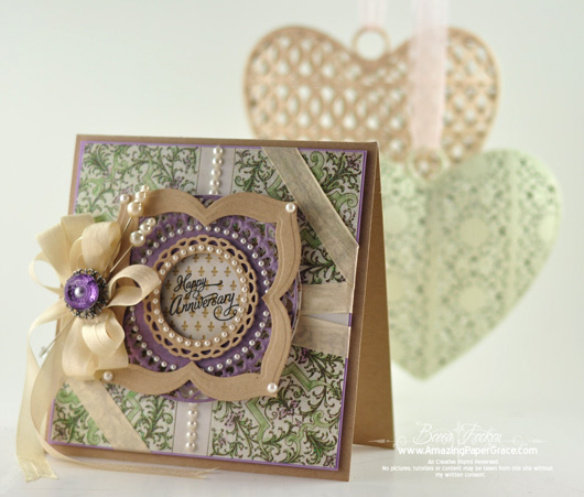
. . . and I haven’t been on speaking terms for a couple of years. It’s actually been kind of tense between us. Yes, pink and blue taunted purple because it had no chance of wriggling it’s way into my life. A definite rarity around here, if you’ve seen a purple card here, you might have snickered a bit and felt sorry for me as you glanced at the ‘barney’-esque awkwardness that would have blurted out loud and clear that it was a foreign color in my repertoire. I hope to change that this year without going totally overboard. In fact, I may even embrace yellow and orange; they’re also on the outskirts of my comfort zone. The other day I purchased a Lavender pad, so here goes :-)
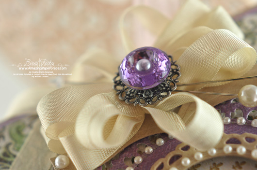
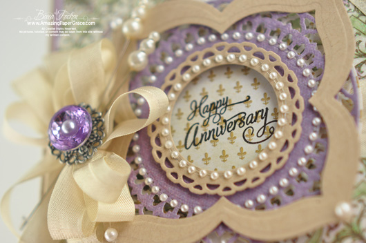
Needing an eventual Anniversary Card, I used Waltzingmouse Stamps set called Say it with Style because of the lovely font! I layered the new Spellbinders™ S4-354 Splendid Circles (two of the largest layers and one of the middle layers) and Spellbinders™ S4-353 Labels Twenty Five. To finish I added some Zva Pearls and ribbon topped off by a Bazzill Button. Yay, purple, . . . I’m taking you out in public today!
| SUPPLIES I USED |
| Stamps: Waltzingmouse Stamps – Say It With Style Paper: DCWV – Chateau Lavender, Bazzill, Kraft Ink: Versafine Onyx Black Accessories: Spellbinders™ S4-354 Splendid Circles, Spellbinders™ S4-353 Labels Twenty Five, Spellbinders™ Standard Circles SM, seam binding, Recollections Pearls, Bazzill Button, Bead Landing Filigree, Zva Creative Pearls |
Thanks so much for stopping in today. I’ll be back soon, you’ll see :-)













another beauty. purple i can live with, not my fav but can do it. but if anyone can get me to like yellow or orange it is you. i find i am not a fan of the “hot” colors.. cool speaks to me. except for red, i do like red.
I love Purple & I love your card it is gorgeous!!!!!!!
oh my goodness, this is gorgeous. Now you’ve gone and done it! Purple will become your favorite color, you just wait :)
You handled the purple well. This is a beautiful card. Looking forward to seeing more in your adventures with the new colors!!!
Your card is lovely (purple happens to be my favorite color) but did you also make those beautiful heart ornaments hanging in the background?
Beautiful card! I love purple!
Purple is my favorite color and this card is just so gorgeous! Can’t wait to see more purple cards!
I’ve been in AWE of your fabulous creations for the last couple of years.
each day brings more beautiful things. LOVE the color purple as well
as all your art work!!!!!
Becca, you brought a real smile to my face this morning! Our stamping group has had chats about being stuck in our own ‘color ruts’ – even held a swap one time that had to have orange on the card. You’ve encouraged me to step out of my color comfort zone and create something with one of the colors I haven’t been on ‘speaking terms’ with lately. Yours is a beautiful card! MAKE it a great day! Thanks.
Becca, this is very tastefully done. Fear NO purple!
I’m not a big fan of purple either, but I just had to make a card for a friend, for her mom’s bday. And she asked for purple. First it was hard to find…then I had to find complimentary colors…well you know what I mean. It turned out pretty well. But still not my fave. I was just thinking about adding yellow and orange to my papers…get out of my head! lol TFS
Love this card, Becca! Purple is my favorite color….all shades! And I am particularly to drawn to green and purple combinations! Bravo for you! I agree with you about yellow and orange…so I’m looking forward to seeing how you elevate those colors to a new level of appreciation!
P.S. I was so pleased that my icon on your blog comments was a purple icon! Silly, huh!? LOL
Gorgeous card and nice to see a change from the pinks.
I’m not much of the real bright purples / or others, but do like the pastel colors in that color range.
I get stuck in a rut by making lots of black / red and white cards.
Becca, I do think you changed me in a whole new color scheme direction.
Stunning card Becca. I love the purple.
You did well with the purple. Not too much. Love the button. Our anniversary isn’t until October, but we’d love to get something like your card for our anniversary! Great job!
Well you guys might have been fighting…but your happy now…this is gorgeous…..awesome job…
Oh, speak up purple!!! This is gorgeous!!! Purple and green are a fav of mine, but the addition of a smidgen of the beige is pure genius!!! This is a splendid card. You’ve really done purple proud!!
Lovely Card, Becca and I really enjoyed your comedy. My day is made by reading your posts and seeing what awesome goodie you share. Keep the purple coming — can’t wait to see the yellow and orange!!
Don’t ever be afraid to use purple again! You have taken it to a new level. My daughter would be so happy because purple is her favorite color and now I know what other colors to use with it! TFS! (Yellow and orange are my least favorite colors to use also)
Wow!!!!! This is awesome! Breathtaking!!!! My favorite color is purple!
Hugs,
Lisa
This is LOVELY Becca!!!!!!!!!!!!! Purple/Lavender & a Mossy Green are one of my FAVORITE pallettes!!!!!!!! I haven’t used it in card making, but I think I’d like to TRY now!!!!!!!!! :) JUST LOVELY!!!!!!!!! :)
Cracking card. Life is too short. Use all the colours , you can do it girl.
Go for it. Can’t wait to see lol
It’s fantastic!
It’s lovely Becca, personally I adore purple :)
Oh Becca, I love purple. My Mom who passed away in early August at the age of 102 told me the day before she died that she wouldn’t wear purple because it was an “old lady”s color”. She never considered herself old. But for me it is my favorite color. The card you made today is beautiful. I am so happy to see you posting so frequently again. I was worried about you for awhile and once again I am amazed at God’s answer to prayer. I keep on praying for you. God Bless!!
Beautiful Becca! The pearls are fabulous accent and the colors are so soft and pretty!
Purple I just love, although maybe the more muted shades!!! Now orange and yellow …. you are really going to struggle to get me on board there!! But never say never!!!!
I love purple, and this is gorgeous.
You do great purple. I, of course, and drawn to the pinks and blues (my faves). Anything you do is wonderful. I enjoy stopping by, just to check in.
I so love the combination of purple and green! Gorgeous papers and lovely layering and framing of the sentiment, that button is a lovely touch too!
I think, it´s a lovely card Becca,and you´ve done a great job on it even it´s outside your comfortzone. But I can only agree to orange, that is a color, I just can´t se my self use for anything EVER LOL.
Oh Becca! This is gorgeous!!! No need to fear purple/lilac, you did a perfect job of it! It is just the right amount, and goes it so well with the moss green and Kraft ! I bet the yellows and oranges you use will be soft and well balanced too. I have every faith in your ability to work with any of the colours in the rainbow! And look forward to seeing them when the time comes.
Oh, I love this card, Becca. It has a perfect balance of colors. Purple is not one of my favorites, either, but you’ve expanded my color repertoire with this card. Thanks so much.
another stunning card!
Just lovely!
Hi Becca, what a perfect card for an anniversary.
Purple is one of those colours that needs careful attention, but you have chosen a perfect (and luscious DCWV) paper and coordinating card and it looks almost regal.
I think as you push on into the new Lavender pad and use more purple, you will see it can make your cards very majestic. I always give Purple and Royal Blue the same respect. Both colours are, in my opinion, very resplendant and even the smallest hint can make a card stand proud. In fact, imagine your card of 14&15 Jan 2011 and Sept 20th 2010 as I think they would be as beautiful in purples/lilacs.
Thank you for showing us something a little different.
Have a good day one and all. Hugs Linda
I feel your pain, Purple is one of my favourite colours but when it comes to crafting I find it strangely difficult to work with. It’s good to know I’m not the only one.
Your card is (as always) beautiful!
Well, after avoiding purple for so long, you did the color proud! Becca, this card is beautiful!
I LOVE your purple card!
While PURPLE is my favorite color …it goes so well with green and blues…Pink is a color I almost never use unless I’m making cards for my littlest grand-daughter…You use pink on most cards and they are beautiful…we each feel our colors differently…I guess that is why we Need to look at the finished products of others to see how wonderful a “different” color can be!! Regardless of color…your cards are so wonderfully put together, so lovingly made…the COLOR is often a side line!!! AND I KNOW COLOR CAN
make a project work or not…but it seems not to be an issue for you…IT ALL WORKS!!!! Lovely Purple Card!!!!
Notthing is wrong , you can match all the color. Purple it is different and it is very nice.
But I am very interested by the beautiful hearts behind. I wish so much it is a new spellbinder dies.
Where they come from if it is not new dies . Please please answer me.
Merci beaucoup
In the waiting to see it…
So beautiful Becca! I happen to love purple, but it can be overdone. You added the perfect amount. I always feel purple paired with green and neutrals is a good combo! That jewel, pins and pearls are so pretty!
Love love love the purple! Beautiful card.
Well, you handle that Purple with such aplomb! Have no fear of yellow and orange, they bright cheery colors that love to play! Thank you encouraging all of us to step out of our comfort zones! Have a blessed day!
Lovely job done with purple, eek! Now a pale butter yellow I like for its warmth and I can now deal with orange as long as it is accompanied with turquoise or aqua. The coolness of the blues calm the orange down a bit.
Can’t wait to see what you do with your challenge colors :D
Hugs,
Beth P
Oh My this is lovely. I don’t dislike purple or orange but I find them extremely difficult to work with. I should take a page from your book and stretch outside my comfort zone. You have done a wonderful job pairing these colors together.
Blessings Bernie
Love this card and the color also. Purple is one of my favorites. Keep doing more of them. Edna
As usual, quite beautiful!
Well, as much as I hate Barney, I DO like purple. This card is just gorgeous! I can’t wait to see what happens when you decide to tackle ornage and yellow! :)
Wow! Im a fairly new fan of yours and didn’t realize that you had your differences with purple! lol … It looks to me as though the two of you have put your differences aside for the sake of beauty! This card, as all of your creations are, is simply stunning! I’m in awe of your amazing creativity! Your creations are truly inspiring! I really appreciate all of the hard work and love you put into all your images, posts and cards! Thank you, also, for your tutorials! You’re an amazing lady!
You made a beautiful card. I believe that it won’t matter what color you use, because you have card making STYLE.
There are so many wonderful shades of purple, and remember, purple indicates royalty. It is my favorite color scheme to work with. You have done it justice. Gorgeous card.
It’s about time you two kissed and made up? Gorgeous card! Thank you!
This card is beautiful. I don’t think you could go wrong with any color. You always know just the right touches and accents to make any color come alive with dignity.
Becca your card is gorgeous! I love purple and it’s different hues and your card incorporates this so elegantly
While purple may not be my favorite color it is my sisters so I try to always make her cards including that color. It’s good to let a color outside of your favorites into your life every once and a while. From the looks of this beautiful card I think you and purple can become good friends.
Dear Becca, so glad you decided it’s time to bury the hatchet and make some time together. It’s positively plummy! I do love all shades of purple from a delicate lilac to regal deep purple. So glad you’re giving it a whirl. Thanks for sharing this.
Well done, Becca, venturing into purple. I love it – favourite colour- very liturgital as well. Share your hesitancy with yellows and oranges and browns for that matter. Good sometimes to step out of our comfort zone and you have done it with your usual finesse. Beautiful!
Some colors are just hard to coordinate. One of them is deep purple, deep blue and of course orange. Certain times of the year center on them but all in all on a daily basis they aren’t really easy to work with. I love the dies you used with green and a tan to cut the strength of the color. Do you ever use stamp images as your focal point? What I am thinking is a lady in the middle or a face etc. It would be all girly with purple and very manly with tans, browns etc. That would help somewhat when using these colors as well. Hats off to you for another beautiful composition. You are really cranking these cards out! And, we are to benefit! If you so desire, keep those midnight lights burning!
It’s true, I haven’t seen you create with the color purple. Well, your card
is just beautiful, embrace the color purple!!! Thanks for brightening my day.
Love the card, would be perfect for me today, it is our 45th anniversary. Thanks for sharing.
Simply beautiful Becca!!! TFS
Becca,
As soon as I saw your card, it was an instant reminder of my mother (may God rest her soul). She adored lavender and green. She would never call it purple, only lavender. She was funny that way. Your card brings back memories of her bedroom, which was so elegantly dressed in a violet print.
I think her especially in this time of year (her birthday was in the beginning of February). I buy a violet each year in her memory.
Your work, as always, is just spectacular. Thanks for sharing it with us.
This card’s color might have been difficult for you but it certainly is wonderful! I know what you mean about shying away from certain color combinations and I have to force myself to sometimes work outside of my comfort color zone.
Love it-purple is so my fav color-I think it stems from a childhood memory of my first bike that my Grandpa made for me-painted purple-with sissy bars and a big banana seat. So did I just date myself? Great card!
Becca,
You and purple need to form a lasting friendship cause you did it up just fine, my dear, just fine. BEAUTIFUL card! I think it is especially beautiful because purple has been my daughter’s favorite color for many years, so I look this color with fondness!
When you tackle yellow, think sunflowers or daisies. Orange, think marigolds! You will come up with something gorgeous, we all know that!
Beautiful cards as always Becca. I have to laugh at you aversion to purple, as I have a similar thing. I was once told in a clothing store that they refer to the lighter shades of purple as “Menopause Mauve”. Apparently woman approaching that faze of there life tend to dress in purple….so no purple for me!!!
Beautiful card! I’m actually surprised you’re not a fan of purple. But I understand not liking a color. Orange is one of those colors that I just have a hard time using. I do force myself to get out of my comfort zone. It really challenges my creativity. I think you did a great job stretching yourself.
Wow Becca, this is a gorgeous, gorgeous, gorgeous card! Love all the detail/pearls/shapes and colors!
Hi Becca: I’ve been reading your daily blogs but haven’t commented recently. Your art is beautiful and I just love the color combination you used today!!!! What a clever lady you are indeed. Thank you for sharing. Blessings.
Remember Proverbs 31 and how the woman was praised because
she “made” purple…(dyed fabric from natural dyes) she was a successful
woman in all areas . . . as you are!
Thank you for this Beautiful Card….Classy!
what a pretty card and love the purple- you knew you could do it if you set your mind to it – now a challenge- try some yellows and purple together- great combo
As usual a very beautiful card!
I too am liking purple more and more.
Thank you for sharing your great talent.
Hugs, Dawn
Purple isn’t my usual go to color.However I found this to be a very beautiful romantic looking card. Great job! :)
I love purple and I love this card. So much detail. A special card for someone special. Thanks for sharing this one, Becca.. Have a special day.
Purple suites you. My purple is RED. I am going to join you on your journey to step outside my comfort zone. I just hope my red is a pretty as your purple. Thanks Becca for your inspirations!!!
These two colors together always work for me… another beauty!!
Thank you, Becca!
Love purples and greens together…also purples and pinks. Use them a lot, but am trying to get out of my color comfort zones too. Tried working with yellow today, but when finished I saw a lot of pink (my favorite) and white in there. Card turned out “just OK”, but nothing like what I had in mind. Now, when it comes to orange—I don’t know about that! Only time I have used it was with purple and black at halloween. I am sure anxious to see what you do with it…if anyone can make it more than “just OK” it will be you! When you jump in feet first, you always come up with a winner…just like today!
Wow! I was surprised to find you have such a color prejudice! LOL! When I first started crafting, I was the same way, though. I couldn’t combine certain colors and definitely not patterns! A whole new world opened up when I abandoned those preconceived notions. Now I love ’em all! I know you will create beauty in whichever colors you chose!
Gorgeous!!! I’m not good at purple either! LOL! But you really made it work beautifully here!
I love purple and this is a beautiful card. It looks like you have been friends forever!!!
I love the purple and I’m glad you are doing more than blue and pink !! LOL ! Honestly, all your cards are beautiful, tho. I love BRIGHT colors, so orange and yellow fine me all the time ! Try it, you’ll love it !
You are just too funny…but I understand, yellow is my favorite color, but I have a hard time creating with it. Go figure. But I do love the purple. Thanks for sharing.
You’d never know that you struggle with purple when looking at this beautiful card. (One of my favorite colors). I love this. :)
You are so cute. I have fallen in love with purple(violet) this year where I was very shy in the past. I am also becoming asociates with yellow(soft yellow) but not friends…yet. Orange on the other hand will never be more than scary Halloween for me; about which I feel certain. This card is sooo beautiful with the lovely shade of green you used
I love the cards you make…they are always so sophisticated and the workmanship is A-1. I do have a question tho. How do you mail them? At our local post office, I have to have cards that can easily pass thru a 1/4 in. slot, not be square, and be under a certain weight. I have always been curious about your ‘putting it in the mail’ habits. Thank you for sharing your more than substantial talents. I always enjoy seeing what you are doing.
Gorgeous, love purple.
Be brave Becca, purple can be very regal if used right. You did a great job with this card. Subtle and not overpowering. I like purple in moderation.
Gorgeous!!
Becca,
Such a beautiful card. My eye always go to anything pink and cream. I did notice this past week in several stores that pale purple and green was very popular in the new items for spring, so these may be the new “in” colors this year. Orange is always the color on the bottom of my list., but do really like pale peach. Loved the sympathy card with the navy. Looking forward to some orange and yellow cards to give all of us some needed inspiration.
Yeah – purple!!!! It looks awesome on this project with the color combo you used. Beautiful!!
I love purple however, being an auburn redhead, it always yellowed my skin, so I loved it from a distance…..and you certainly did a cool job with the touch of purple in this card……very nicely done. I always love your pinks and peaches, tans, and greens, etc, however, I think you would also do marvelous things with yellow and orange….think about those two colors together – smashing!
Purple is such a beautiful color. It’s a royal color, yet it is a color that you like or dislike. Purple and green is a nice color combination. Your card is beautiful Becca. Love the addition of the pearls and the big bauble, a nice added touch. Beautiful wok. As always Becca, TFS!!! :-D
Ooohhh, gorgeous! You need to do more purple, Becca – this one is beautiful! Well …. actually ….. EVERYTHING you do is beautiful!
Another beautiful public card . . . But today I have to comment about your wonderful sense of humor and engaging writing style. At first I hopped to your blog for paper inspiration. Now I am hooked to your wit, faith, and spirit. Bless you Becca.
Purple power!
It’s gorgeous. You can never go wrong using green with the purple It just makes it exciting to look at.
Wow, you are amazingly talented and creative and a real inspiration to me.
Thanks also to companies that create such beautiful stamps and dies that help make it possible. I love sitting down to make a card for friends and family.
Beautiful! Wow now that has some bling with all those beautiful pearls! I love purple but not a big fan of orange.
Hooray for purple and green! Your card is wonderful. I hope to see more purple in your future!
Now that’s a great way to do purple! Your card is so pretty – I love purple and green together – it looks great with the cream/kraft color as well! Nicely done – keep up the beautiful work!
Becca, this card is so beautiful! I am with you on Yellow I have only ever made one card in yellow that did not deserve to be trashed immediately!
I think you have wonderfully patched up any differences you and the color purple may have had in the past. Looks like a new friendly relationship is in store for you ! Great job… and may I also add that your photography is incredible.. You always seem to create the perfect little venue with your add on items, such as the hearts in this picture, and it creates such a nice spotlight for your card creations. That is an incredible talent in itself.
Gorgeous and I love purple!!
Purple and green go so well together and neither of them are overdone on your card….no one would guess by this card that you didn’t like any of the colours as you have handled them so well. Another beautiful masterpeice!
LOL Eileen
Hi Bekka!
This card is gorgeous!! (I’m confused about the squarish label frame over the circles, it doesn’t look like the Labels 25 Debbie had on her blog this week, can you help me know what it is? Just making up a wish list, thank you!)
Stepping outside the color box with purple! I love it and the card is beautiful. Who wouldn’t enjoy getting this card on their anniversary!
Just lovely. Love the combination of colors. Your creative genius is amazing!
I so do love that new labels – the quatrefoil has been a favourite shape of mine for many years. Your courageous foray into purple is well done!
You think purple reminds YOU of the dinosaur….try having his name as your surname!! (yes, its Monica Barney).
Gosh, we must have been on the same thought-wave pattern. I also made a post about the color purple on my blog a few days ago. Seems I just can’t get into the color but, I have made it one of my 2012 goals of the year –to become very familiar with it, study it more in examples, etc. Thank you for your share on this also. I thought I was a loner on the color purple!
I’m not a big fan of purple either, but your card is gorgeous! I may have to branch out as well after seeing this beautiful creation.
Becca –
Purple is my FAVORITE!! Looking forward to your beautiful creations with purple!!
Shirley
Your card design is beautiful, but I guess you just can’t take me out in public cause try as I might, I just am not a purple fan !!!!! But it sounds as thou most do love it. Your card is gorgeous thou.
Marcie
This is sooooo pretty, purple is my current favorite color. God bless…. Denice
You have brought purple to a whole new level. The card is stunning and your future color selections will be knock outs. Thanks for sharing.
pretty card. I love purple, I have a problem with anything green or orange.
They are the ones not in my comfort zone except maybe on halloween
I see a card in green and I think, I don’t know who would like that! Unless its a piece of grass or green tree.
Don’t know why we have dislikes with certain colors. Wish I didn’t.
Purple is my all time favorite color. To see something you have made with that color is very exciting for me. Thanks, I hope to see more.
So glad purple came out to play today. Your card is absolutely lovely. I’m with you on orange and yellow – neither are colours that I gravitate towards.
This is simply amazing. Thank you for sharing your projects, they are really appreciated.
What size pearls do you use when you make fancy pins out of corsage pins??